03 / 04
Enlumora 3.0
Glowing from Within: The Logic Behind the Design System
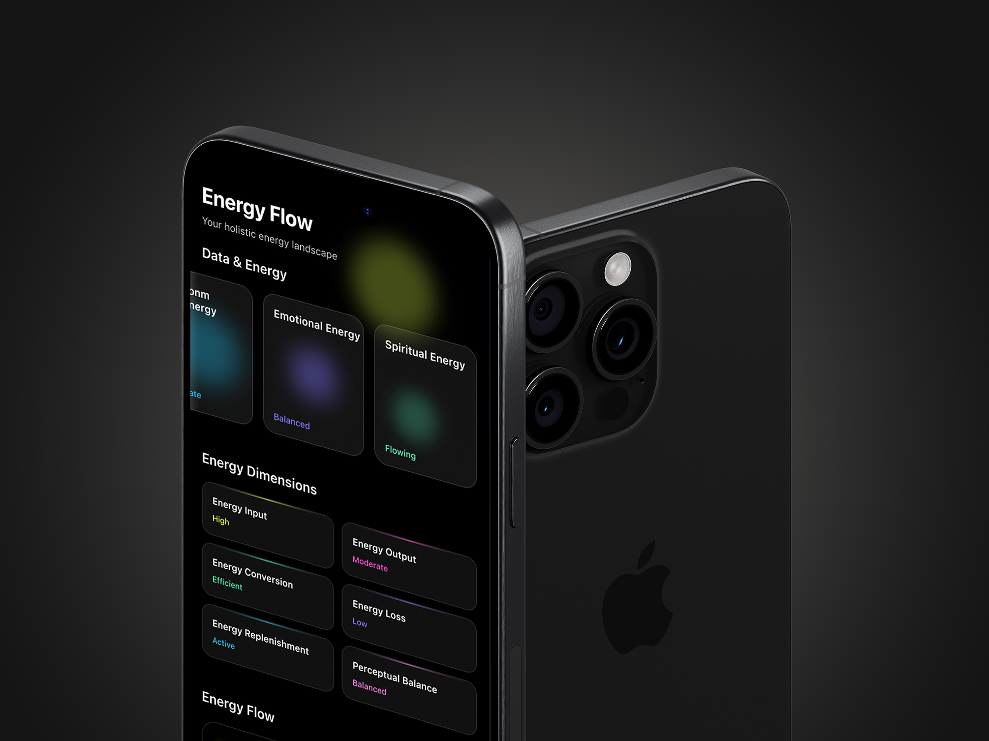
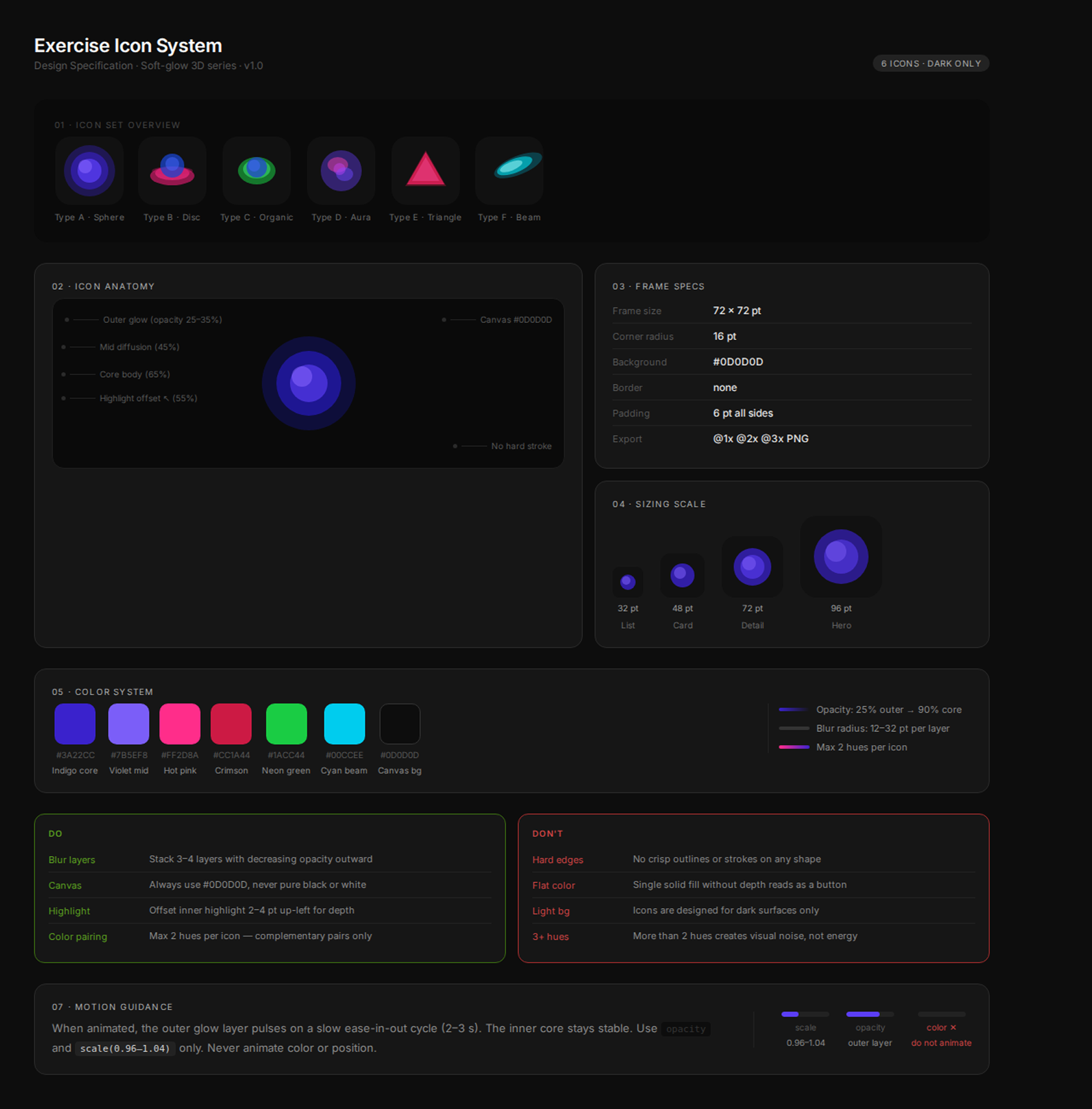
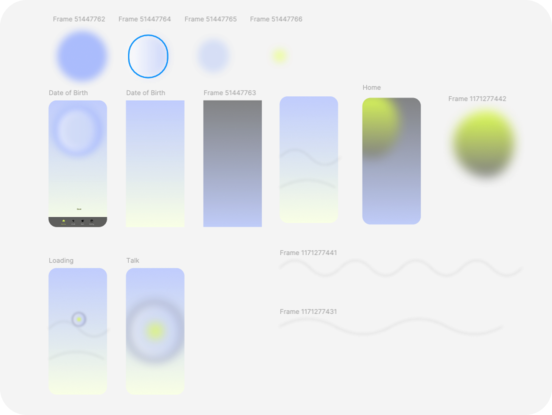
I explored six visual directions, each negotiating a different tension — between energy and restraint, between the rawness of physical effort and the precision of a digital surface. Some directions leaned into hard geometry; others dissolved into pure abstraction. What we kept returning to was light: not as decoration, but as the primary design material.
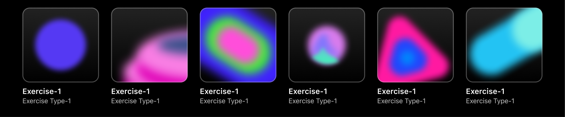
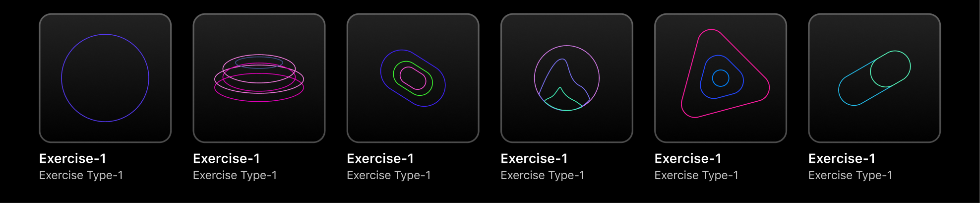
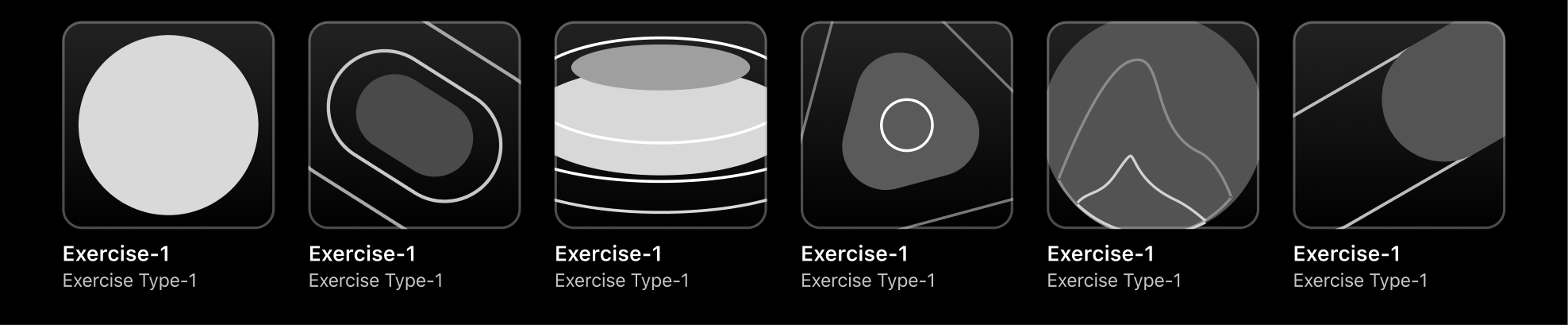
The final system is built on a single constraint — every icon is an object that appears to emit rather than reflect. Soft-diffused cores, layered opacity, and hue pairings drawn from the visible spectrum's most saturated edge. Designed for 72 pixels but legible at 32, each form had to read instantly in a feed crowded with photography, motion, and type — without competing and without disappearing.
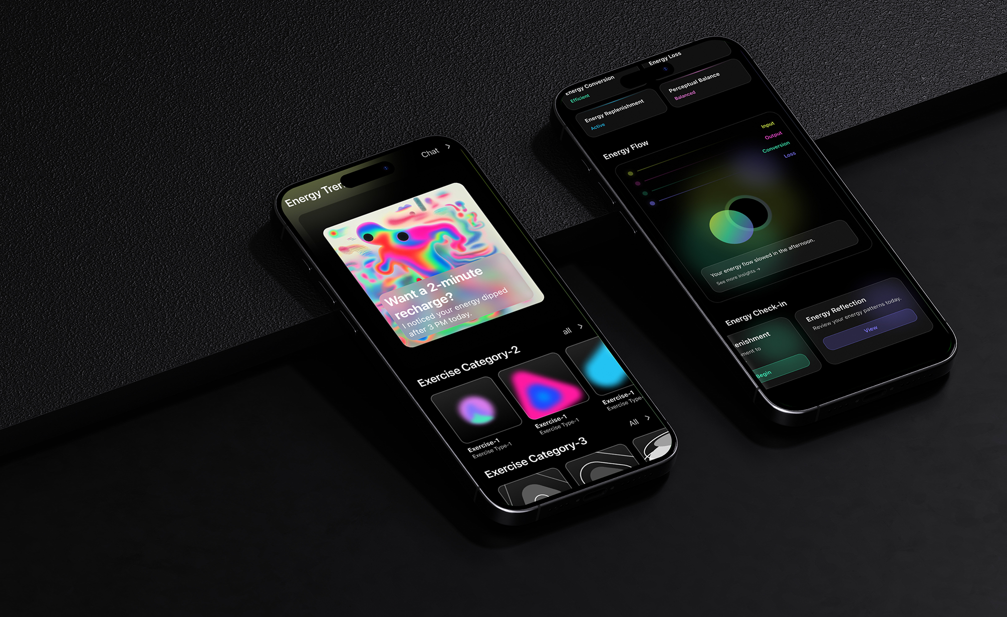
Six icons. Six distinct shape languages. One shared atmosphere. The sphere grounds the set in something familiar. The disc introduces depth through foreshortening. The organic form breaks symmetry deliberately. The aura resists definition — its edges are suggestions, not boundaries. The triangle is the only icon with an implied direction, a point that moves the eye. The beam is pure velocity.
The resulting system earns attention without demanding it. It tells users what kind of effort they're about to make before a single word of copy loads — and it does it in the language of light.
Older version
This is version 3.0 — and the version number matters.
Before arriving here, there were two earlier iterations. The first was a proof of concept: rough around the edges, heavy on ambition, light on restraint. The second refined the visual language but still left unsolved tensions between hierarchy and density. Each version was shared, critiqued, and dismantled — not out of indecision, but out of a genuine belief that good design only reveals itself through the pressure of real feedback.
What changed between versions wasn't just the aesthetic. It was the reasoning. Early decisions made on instinct were replaced by ones made on evidence — from testers who couldn't find what they needed, from mentors who asked why, from my own discomfort sitting with something that almost worked. The willingness to throw out what felt finished and start from a more honest place is, I've come to think, the most transferable skill a designer can have.
Version 3.0 isn't the end of that process. It's just the current best answer.
1.0 version
2.0 version
Why we changed
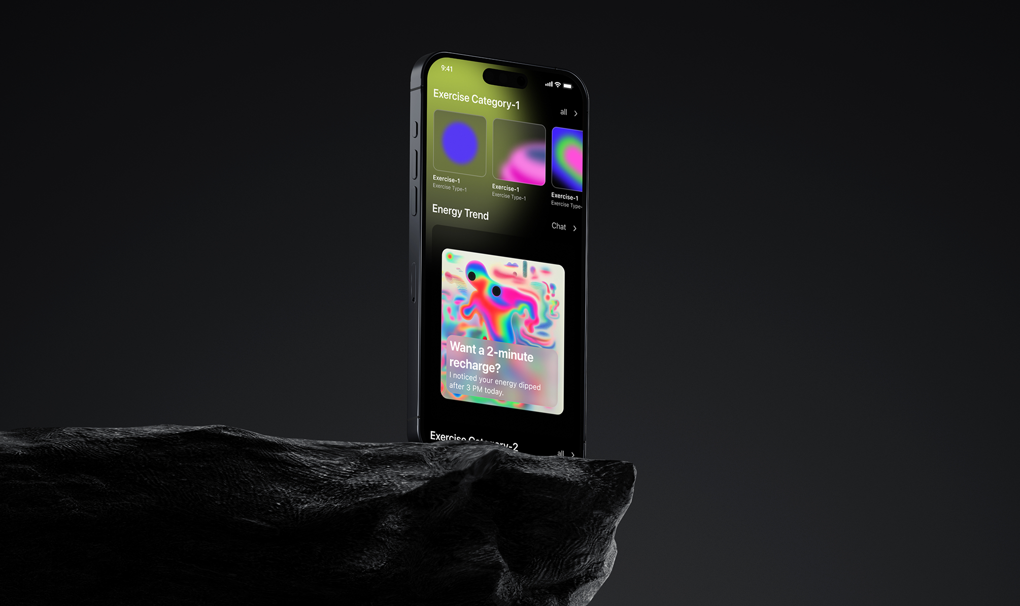
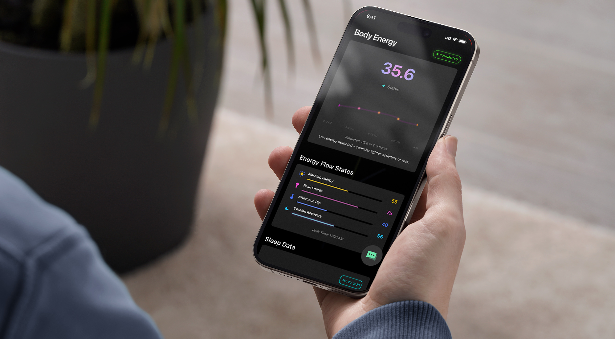
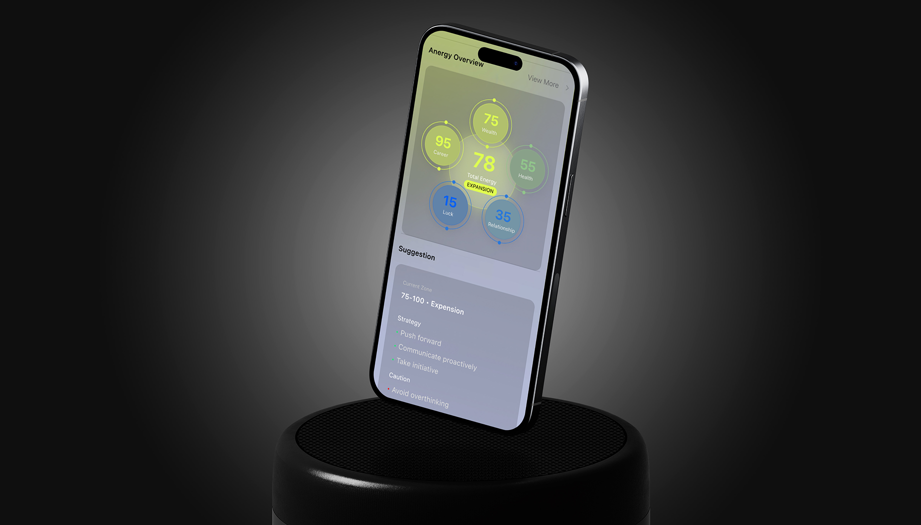
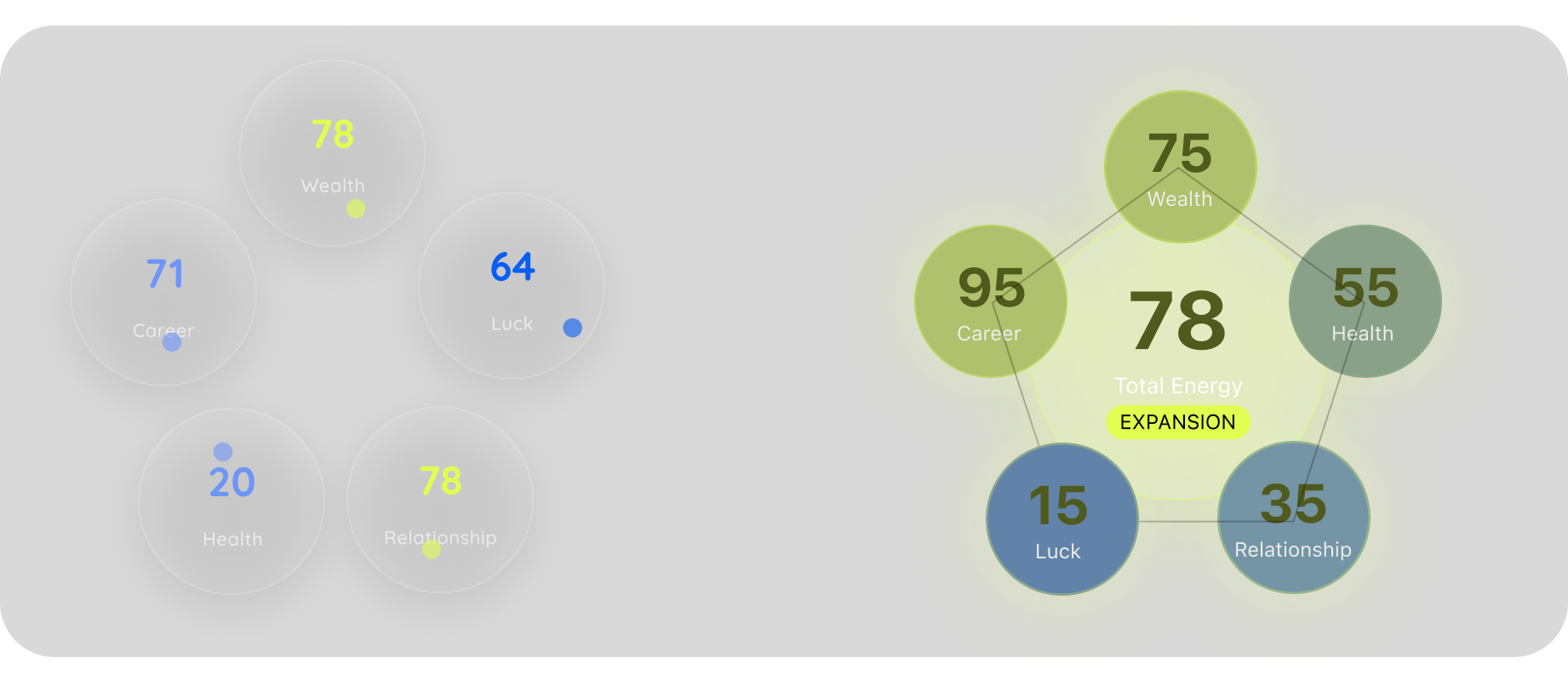
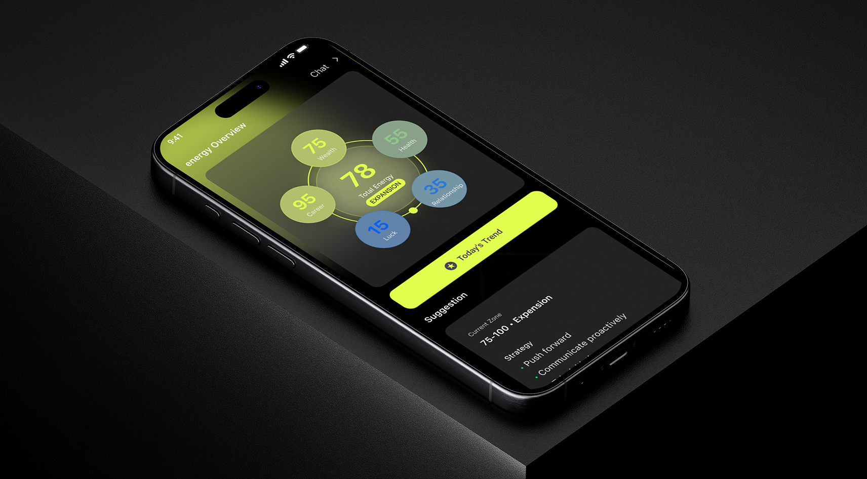
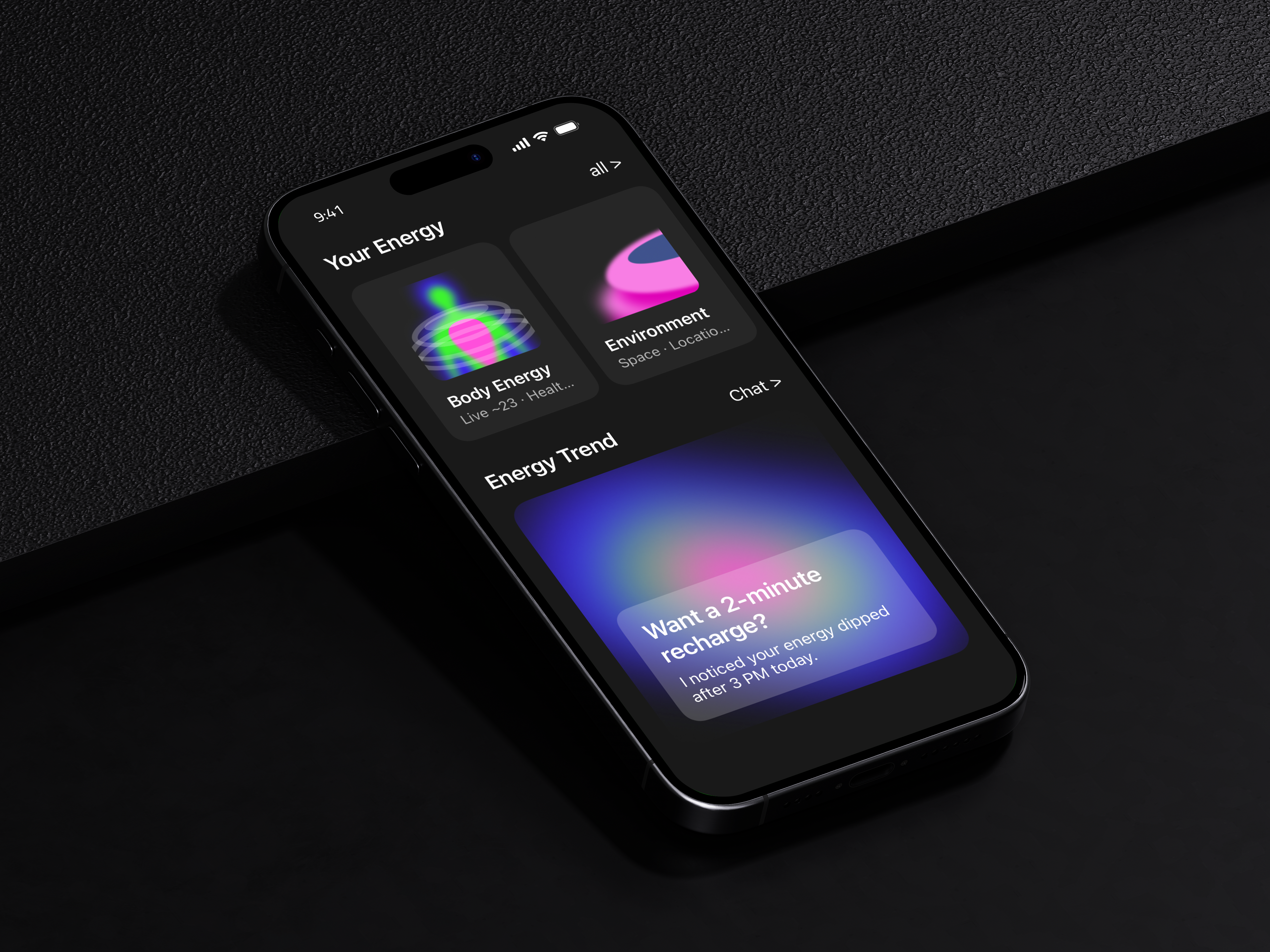
The feedback was consistent: users understood the data but didn't feel anything. The screen was a dashboard when it needed to be an experience.
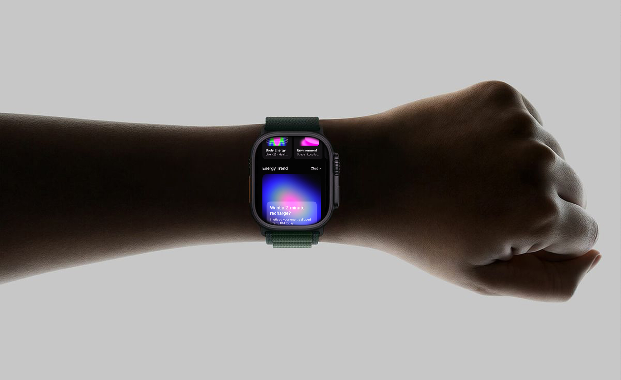
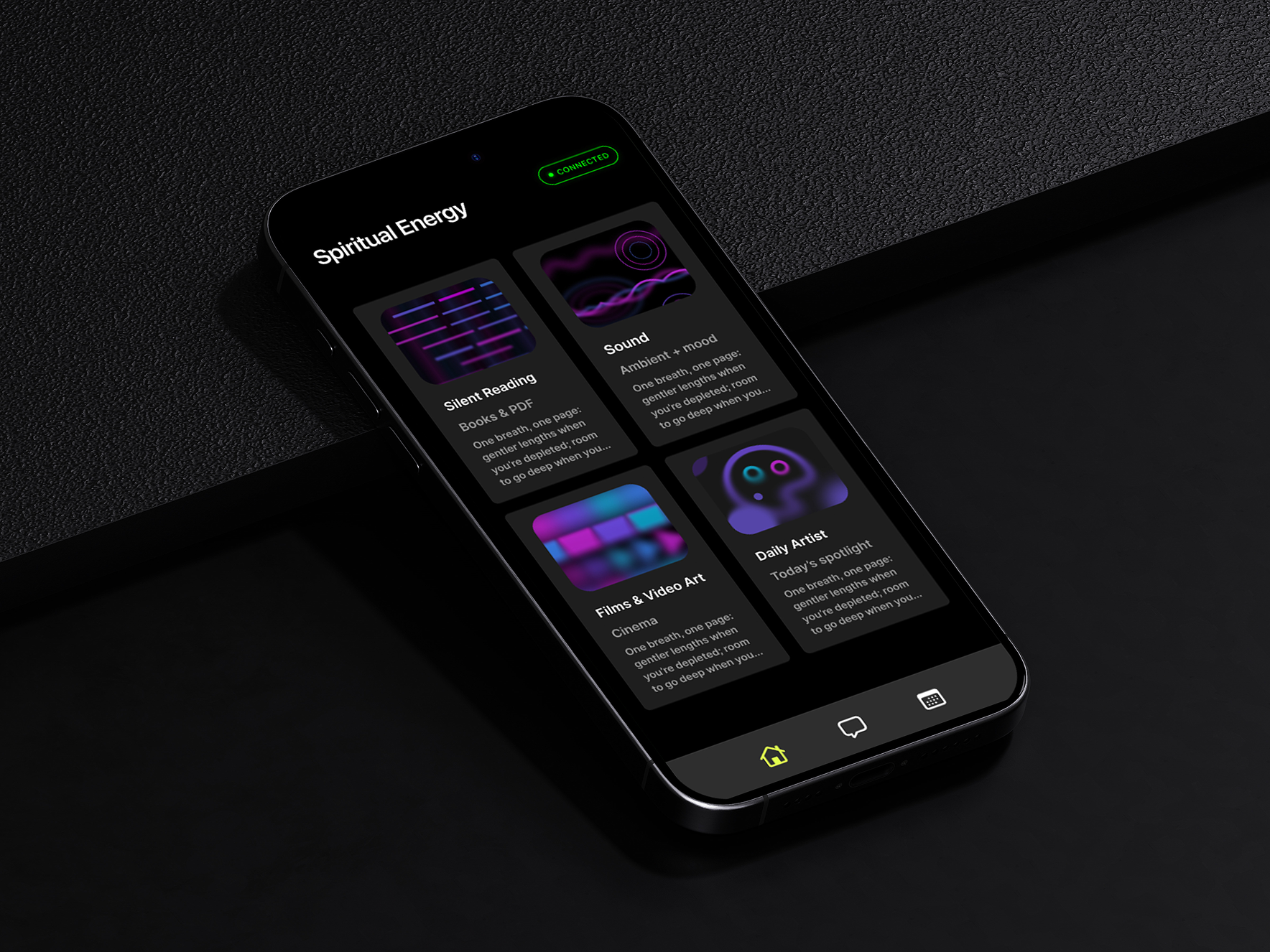
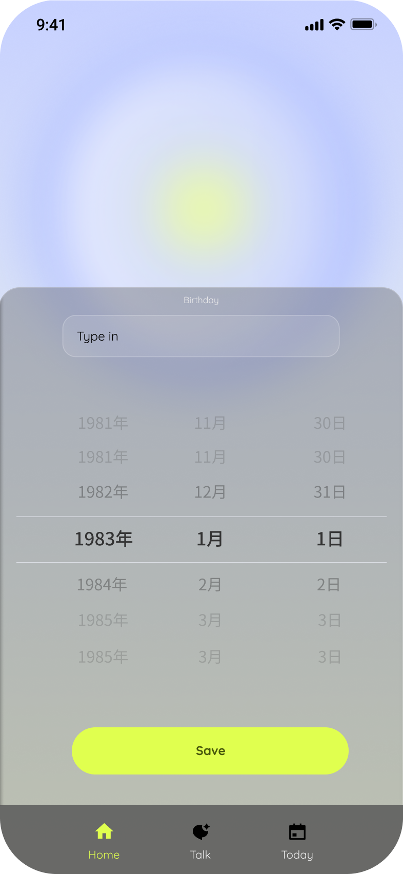
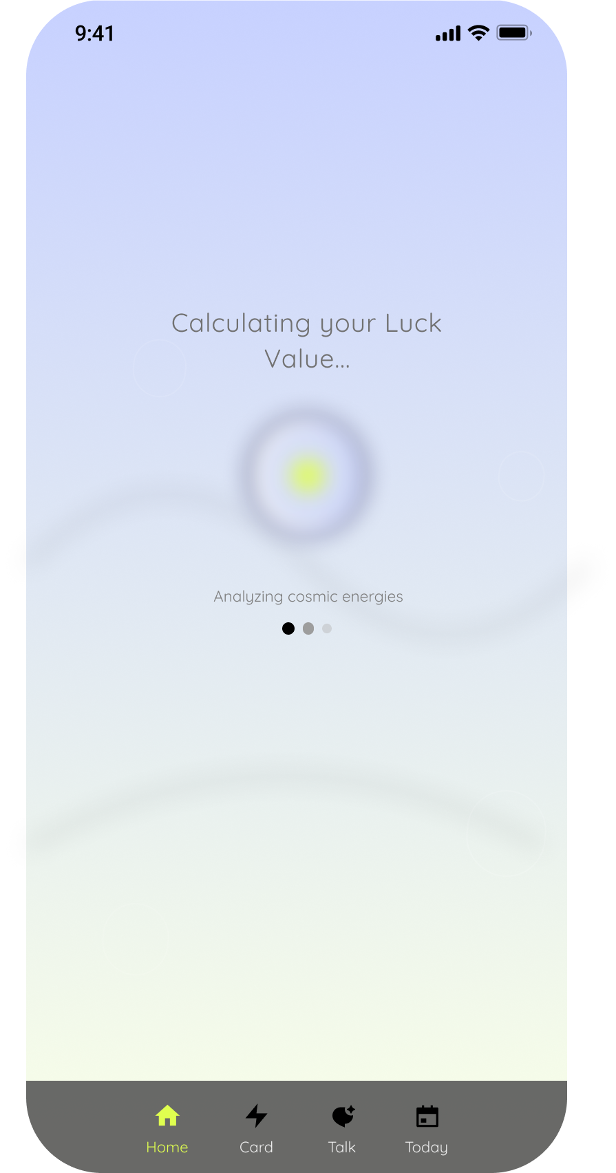
V2 answered that with a single decision — go dark, and mean it. Switching to a deep black canvas wasn't cosmetic. It was structural: it forced every element to earn its place through contrast, and it gave the glowing icon system the environment it actually needed to land. The hierarchy simplified. The featured AI prompt card ("Want a 2-minute recharge?") replaced the data cluster as the emotional anchor. Typography got heavier and more confident. The three-tab navigation stayed, but everything around it became clearer about what the app was for.
Currently in TestFlight. Iterated to V3 based on early tester feedback.