01 / 03
KeploreAI
KeploreAI is a cloud-based AI agent platform built on OpenHands. It provides on-demand Memory, CPU, and GPU resources so engineers can deploy, train, and run large AI models without configuring local environments. Users interact with the agent through natural language — the agent autonomously plans tasks, writes code, configures environments, and delivers results.
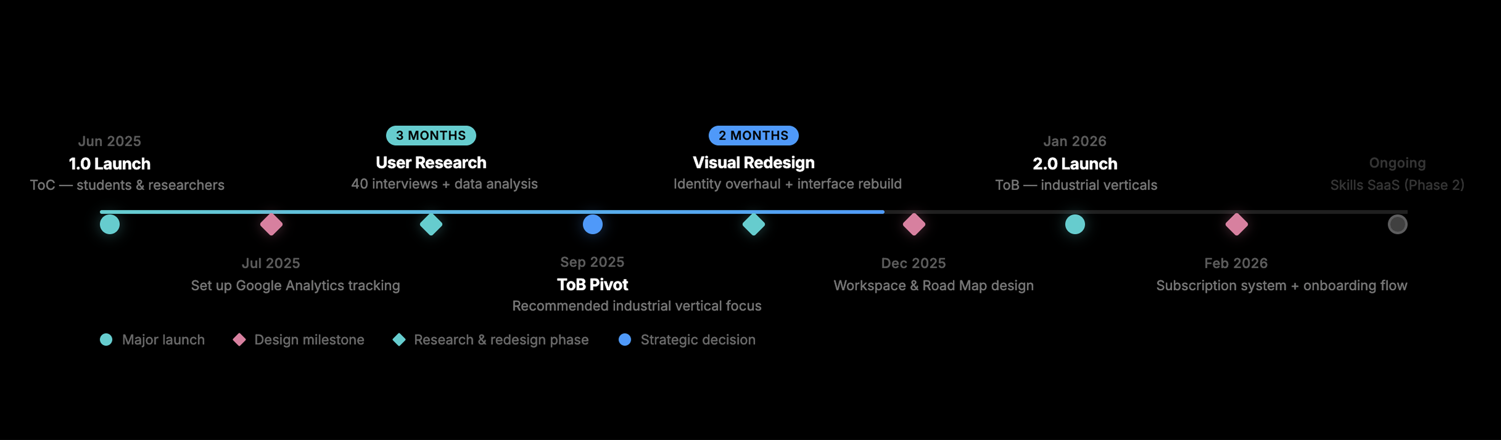
The platform launched in mid-2025 as a ToC product targeting researchers and students. After analyzing usage data and conducting user interviews, we pivoted to a ToB model focused on industrial verticals — manufacturing defect detection, automotive R&D, and robotics system integration.
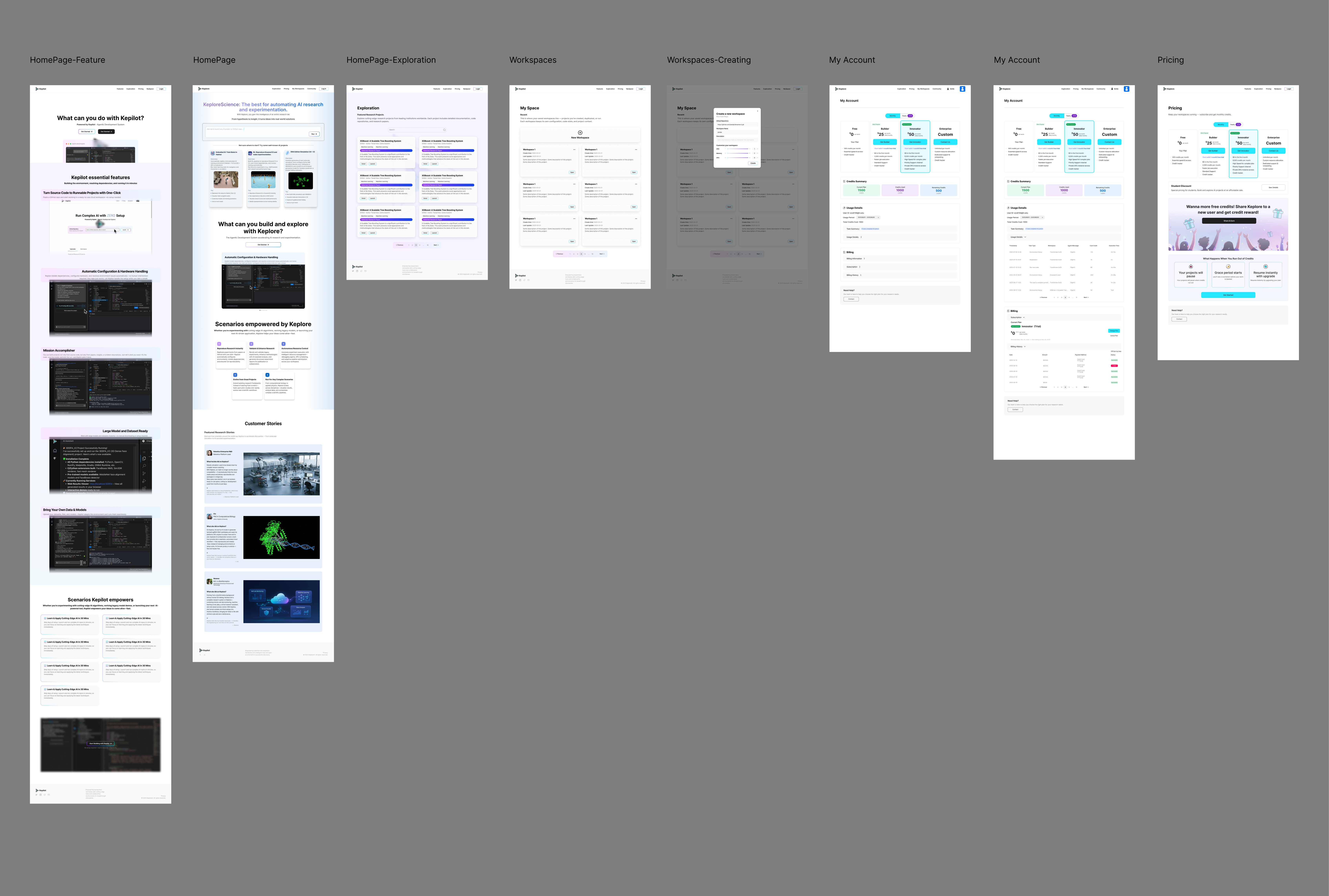
As the sole UI/UX designer, I led the full redesign from 1.0 to 2.0: visual identity, product interface, onboarding flow, subscription system, and marketing pages.
01
Visual Identity Overhaul
Rebuild the visual language from approachable academic to precise industrial — across marketing pages, product UI, and component system.
02
Workspace & Agentic UX
Design a transparent execution interface that lets engineers audit, track, and trust what the AI agent is doing.
03
Subscription & Billing System
Create a complete pricing and plan management flow for a four-tier SaaS model — from selection to cancellation and feedback collection.
Our design strategy for 2.0 was driven by a fundamental shift: the product was no longer serving students exploring AI — it was serving engineers shipping production systems. Every design decision had to answer one question: does this make a senior engineer trust this tool enough to use it for real work?
This meant rebuilding the visual language to signal capability, not friendliness. It meant making the AI agent's execution process transparent and auditable, not hidden behind a chat interface. And it meant designing onboarding that collects engineering context upfront, so the agent can deliver relevant results from the first interaction.
Success metrics
- Complete visual identity overhaul and product redesign by Jan 2026.
- Support 3 distinct enterprise client types with customized engagement models.
- Achieve sustainable product growth through ToB project delivery pipeline.
Version 1.0
Version 1.0 launched in June 2025, targeting students and researchers who needed help configuring AI model environments. The visual language was approachable and light — friendly type, white backgrounds, low information density. It worked for the intended audience.
But the data told a different story.
The research that changed everything
70%
of actual users were industrial engineers, not students. The initial academic positioning was completely inverted.
40
user interviews conducted. I led the research, compiled the findings, and presented recommendations to the CEO.
3d→½d
an engineer's direct quote on environment setup time reduction.
"Setting up environments for different technical experiments used to take 3 full days. With KeploreAI, it takes half a day."
— Industrial engineer, user interview
After launch, I set up Google Analytics to track user behavior across pages — what they spent time on, and what projects they actually built. The pattern was clear: engineers from manufacturing, automotive, and robotics companies were the power users, not the students we designed for.
I followed up with approximately 40 user interviews. Engineers consistently described the same pain point: they needed to rapidly test different technical approaches, but environment configuration consumed most of their time. Students used the tool occasionally; engineers depended on it.
The cost structure reinforced the finding. AI agent computation is billed per-token — more users means linearly higher costs. A ToC model with general-purpose users would never achieve healthy margins. But industrial clients had specific, quantifiable needs and were willing to pay for reliable delivery.
ToC → ToB
Based on these findings, I recommended a full pivot to ToB industrial verticals. This wasn't a gradual optimization — it meant rethinking who the user is, what they need, and how every surface of the product should look, feel, and function.
The business model shifted from self-serve SaaS to project-based delivery: Keplore's own engineers use the platform to complete client projects ($5K–$50K per engagement), building reusable industrial skills along the way. Phase 2 will offer these skills as a SaaS product, billed per execution.
Every design module that follows — visual identity, workspace interface, subscription system — was rebuilt to serve this new direction.
Visual identity overhaul
Version 1.0 was designed to feel approachable — light backgrounds, friendly typography, low visual density. That was right for students. But engineers who debug production systems for a living don't want a product that looks like a learning tool. They want something that looks like it can handle serious work.
For 2.0, I rebuilt the visual language entirely: dark surfaces, high-contrast data displays, technical density. Not because dark themes are trendy — because the aesthetic needed to signal capability and precision.
Approachable · Light · Academic
Precise · Dark · Industrial
Marketing pages
The visual overhaul extended to two marketing pages for different ToB audiences:
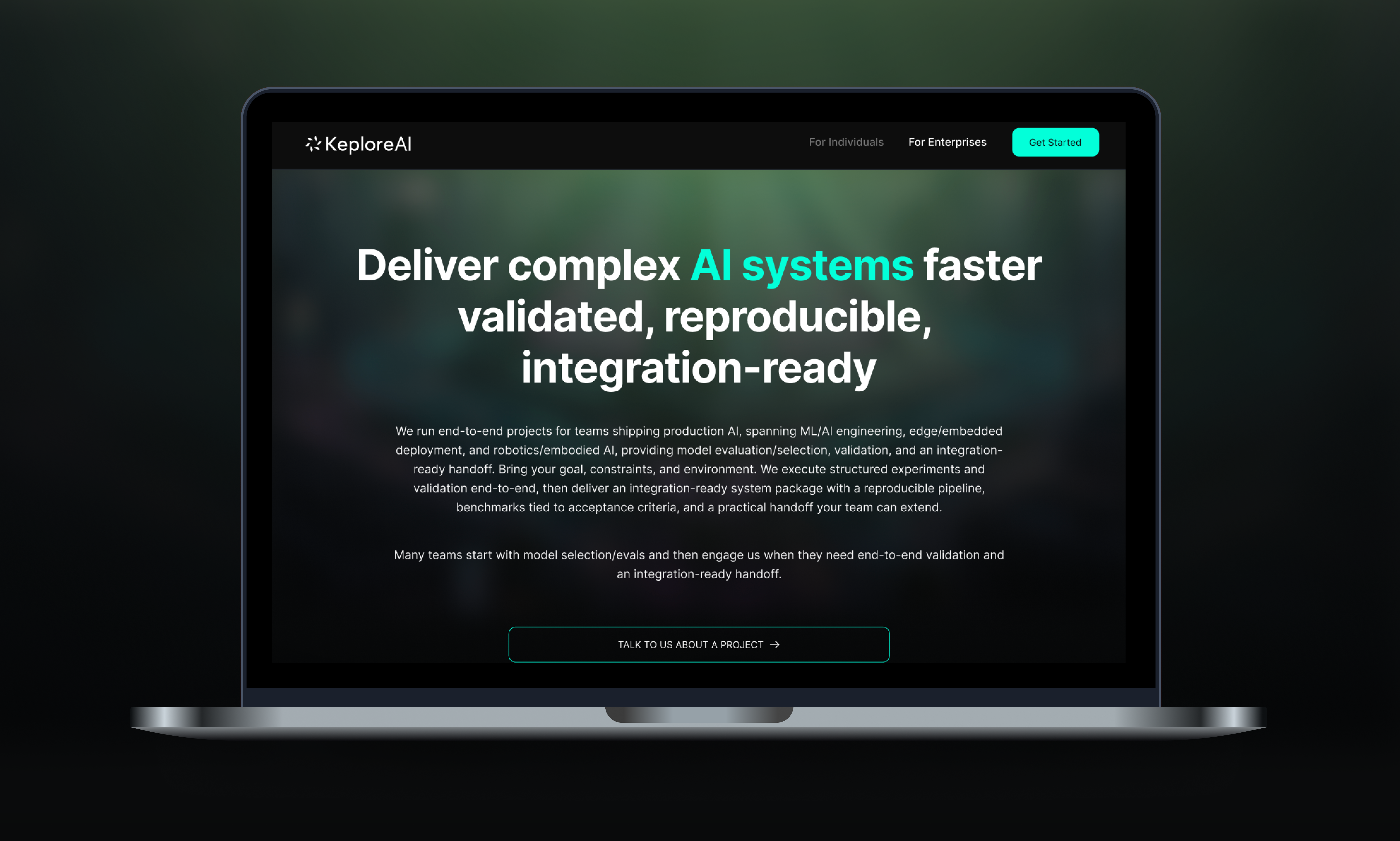
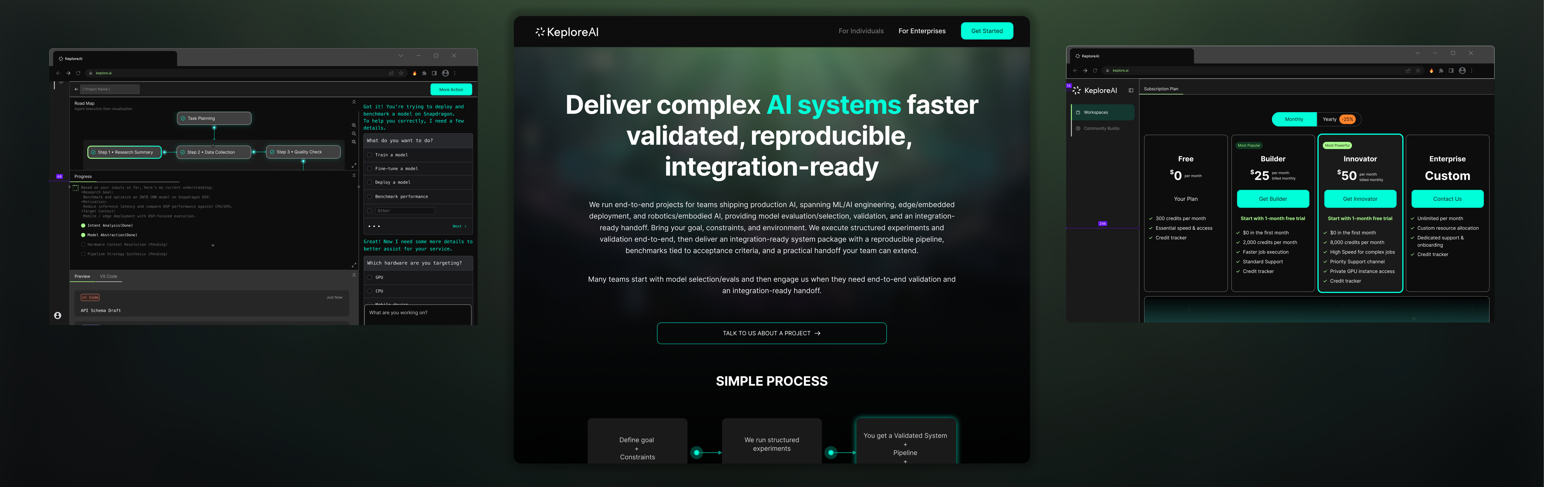
For Individuals — targeting independent engineers and researchers. Positioned around "delivering complete AI solutions for the most complex engineering challenges." Technical but still accessible.
For Enterprises — targeting teams shipping production AI. Positioned around "deliver complex AI systems faster — validated, reproducible, integration-ready." Higher density, more technical specifics, engagement models.
Workspace & agentic UX
The problem
The core UX challenge for an AI agent platform: engineers don't trust black boxes. When an agent executes tasks autonomously — configuring environments, writing code, running experiments — users can't see what it's doing, why it made certain choices, or where something went wrong. For engineers who are used to debugging every line of code, this is unacceptable.
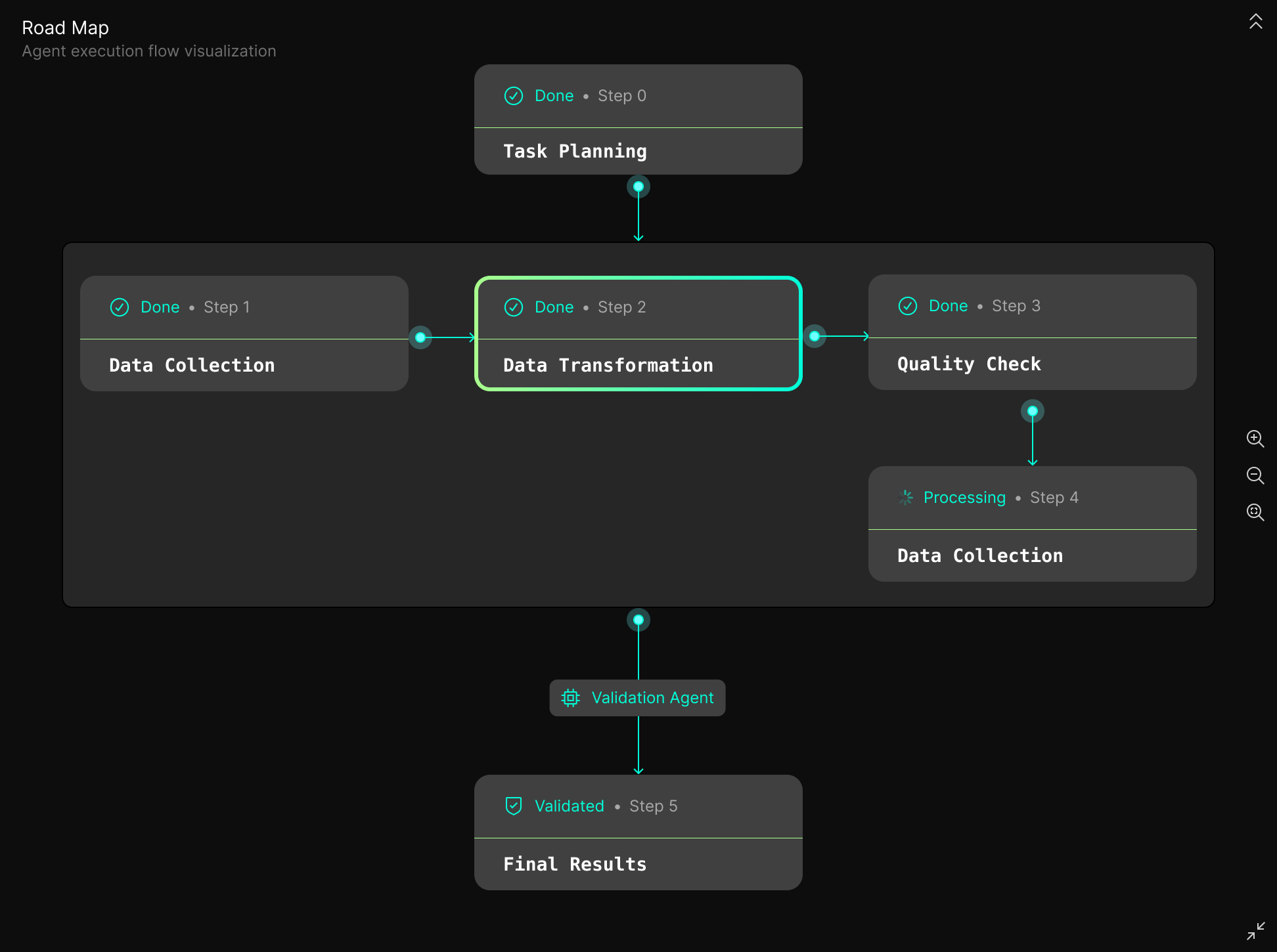
Road Map: making the agent auditable
The solution was a three-layer Road Map that turns the agent's execution process into a visual, interactive audit trail:
Phase — the task is broken into strategic stages (e.g., Task Planning → Data Collection → Data Transformation → Quality Check → Final Results).
Sub-steps — each phase expands into specific engineering actions, with real-time status indicators (Done / Processing / Pending).
Contextual Jump — clicking any sub-step navigates the chat panel to the exact AI instruction that produced it. Engineers can trace any result back to its origin.
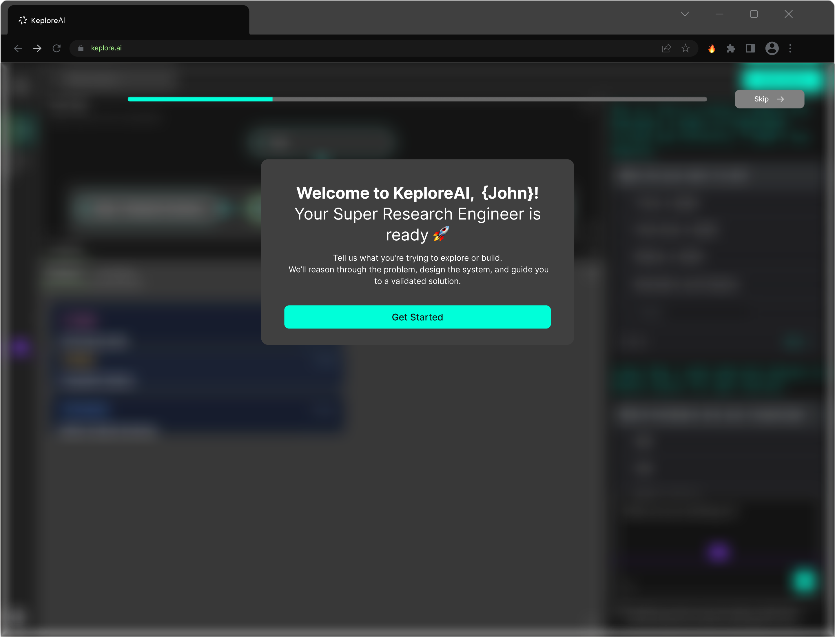
Loading experience: turning wait time into value
Runtime initialization has physical latency that can't be eliminated. Instead of showing a spinner, I designed a pre-loaded conversation agent that activates during the loading phase. Users can refine their task requirements while the environment spins up — reducing the perception of dead time and providing the agent with more precise instructions for execution.
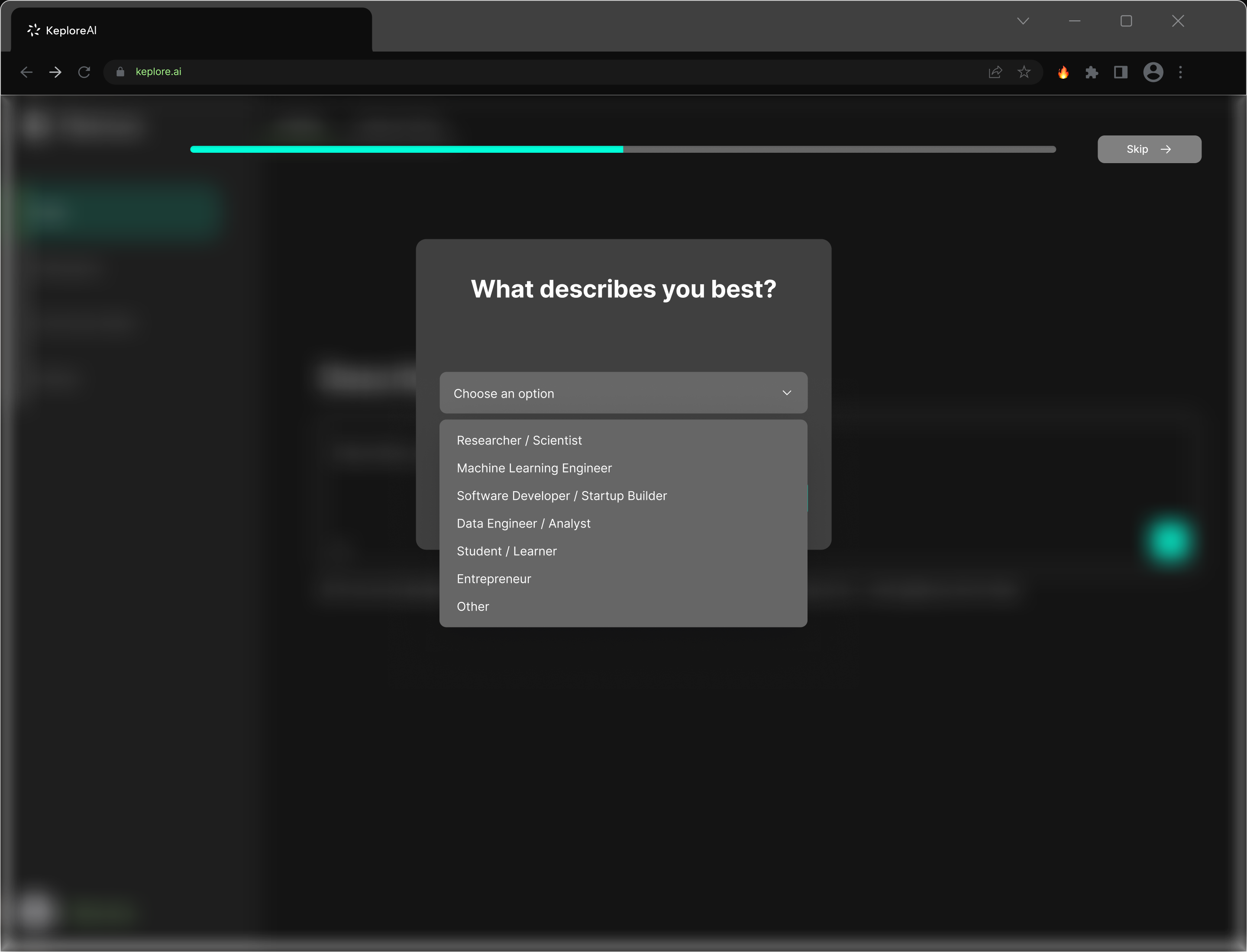
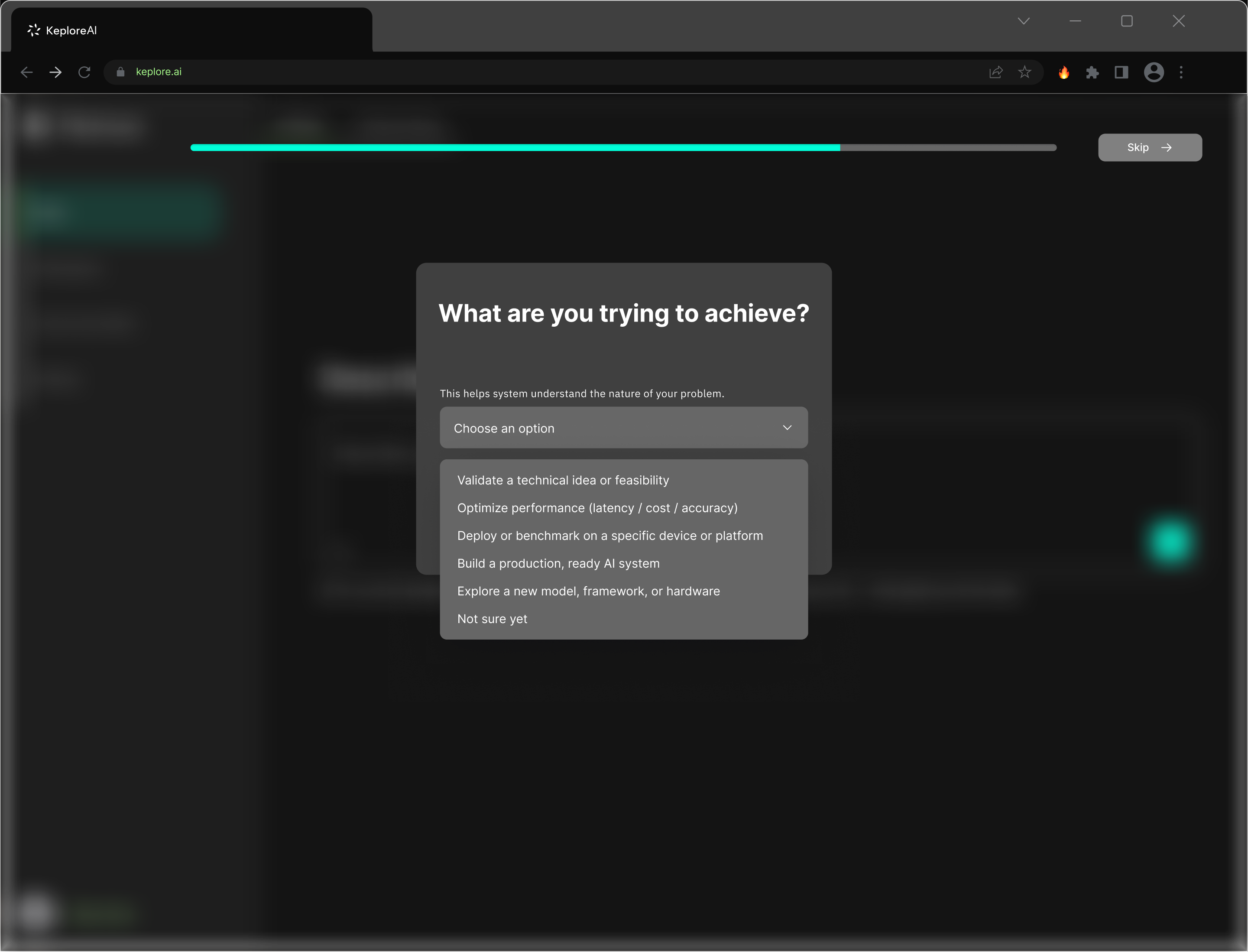
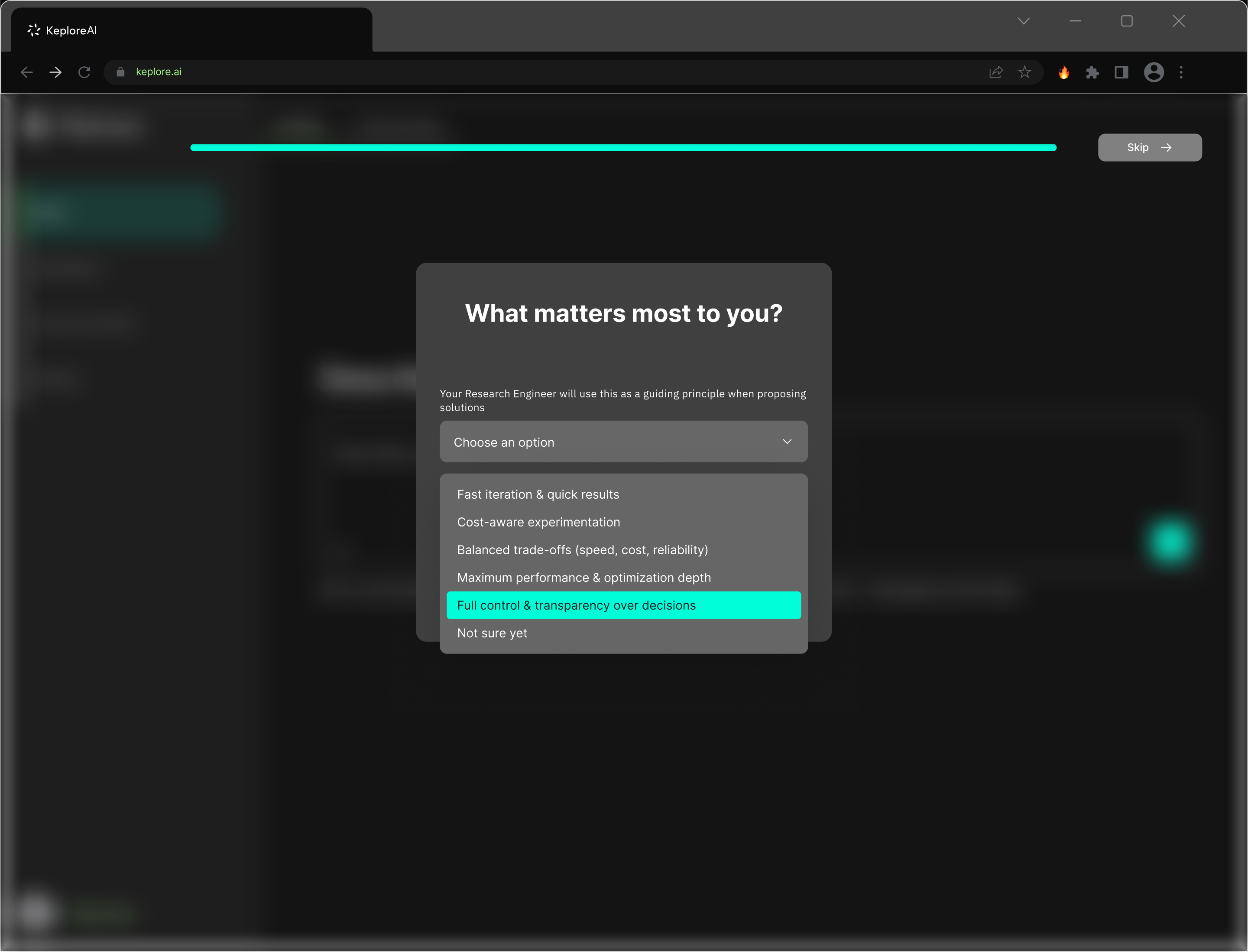
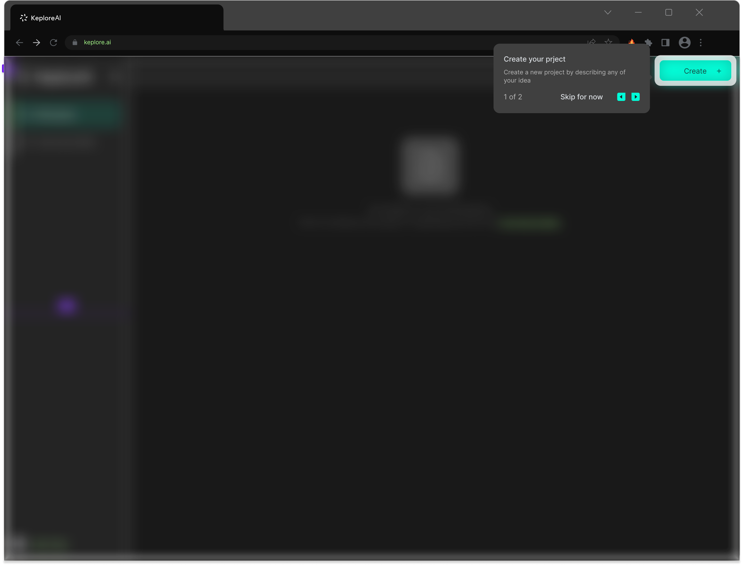
Onboarding: engineering context collection
The onboarding flow was designed to collect engineering context before the first interaction — so the agent can deliver relevant results immediately rather than asking basic questions mid-task.
The sequence is progressive:
- "What describes you best?" — role identification (Researcher / ML Engineer / Software Developer / Data Engineer / Student / Entrepreneur)
- "What are you trying to achieve?" — task type (Validate feasibility / Optimize performance / Deploy on device / Build production system / Explore framework)
- "What matters most to you?" — priority signal (Fast iteration / Cost-aware / Balanced trade-offs / Maximum performance / Full control & transparency)
Each option was derived from the 40 user interviews — these are the real dimensions along which engineers differ.
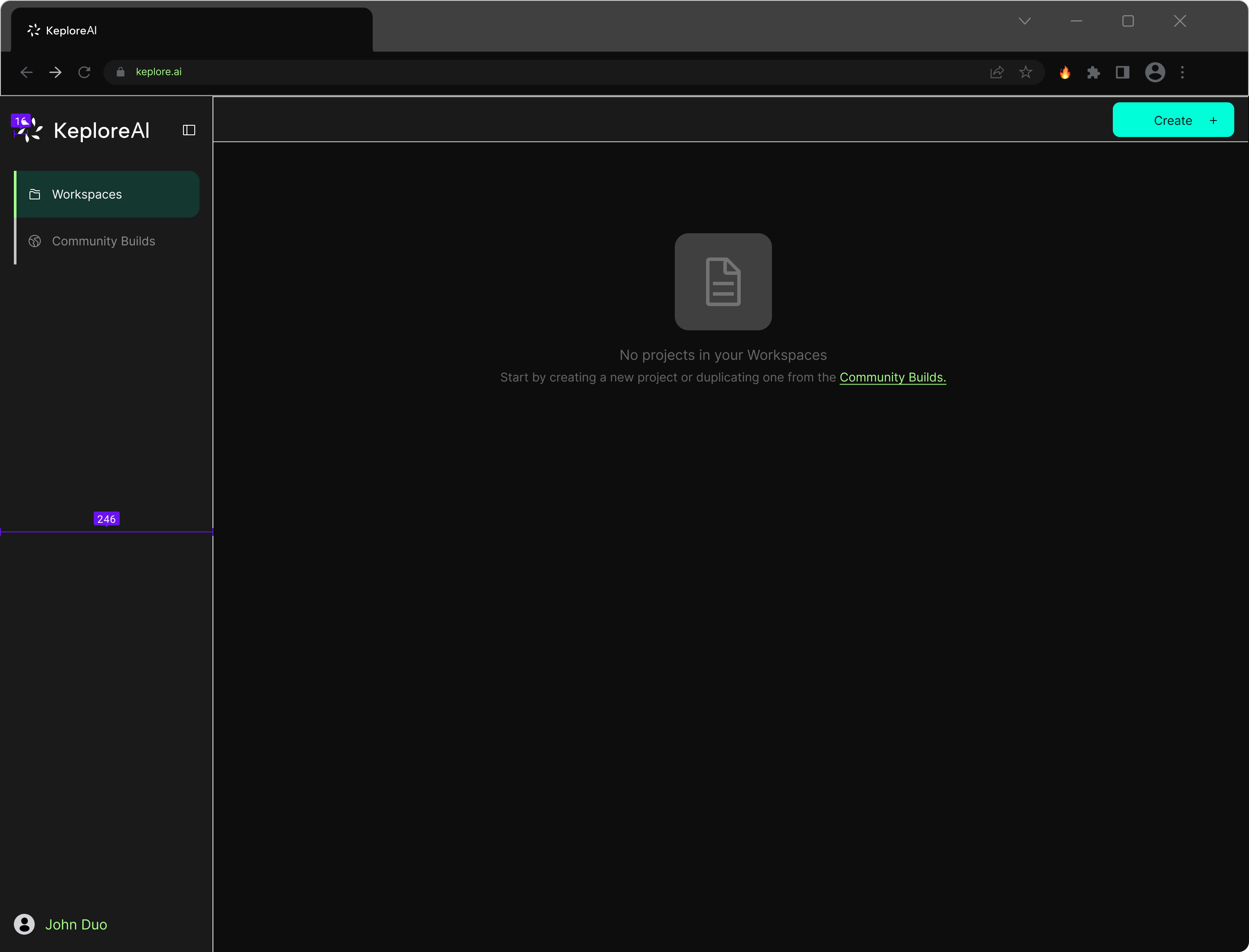
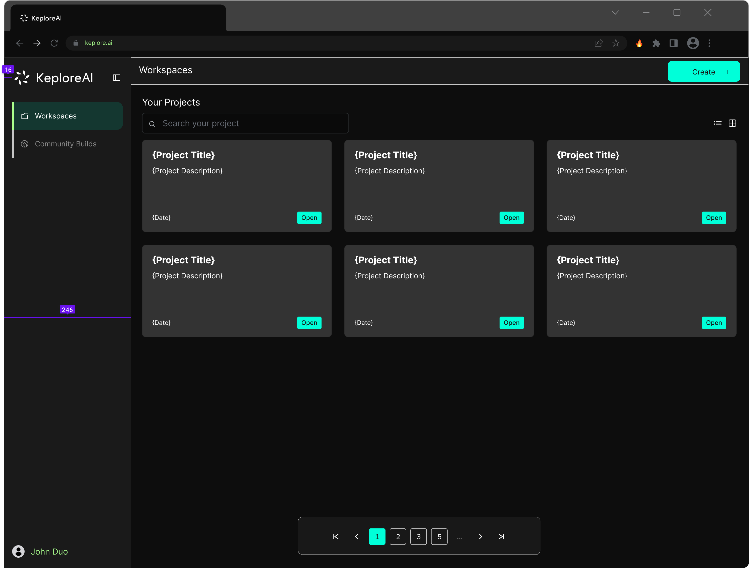
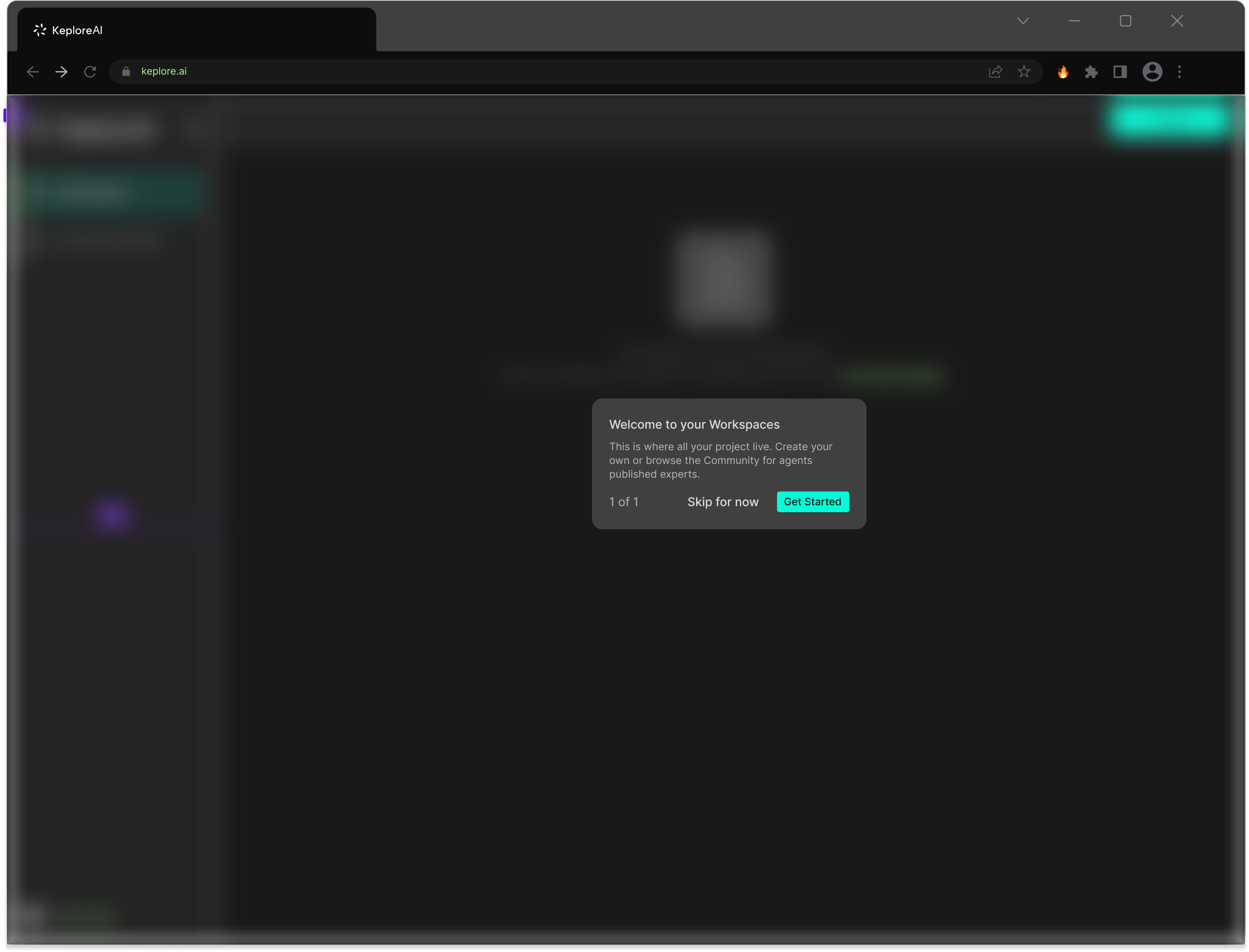
Workspace states
I also designed the workspace for multiple states to handle first-time and returning users:
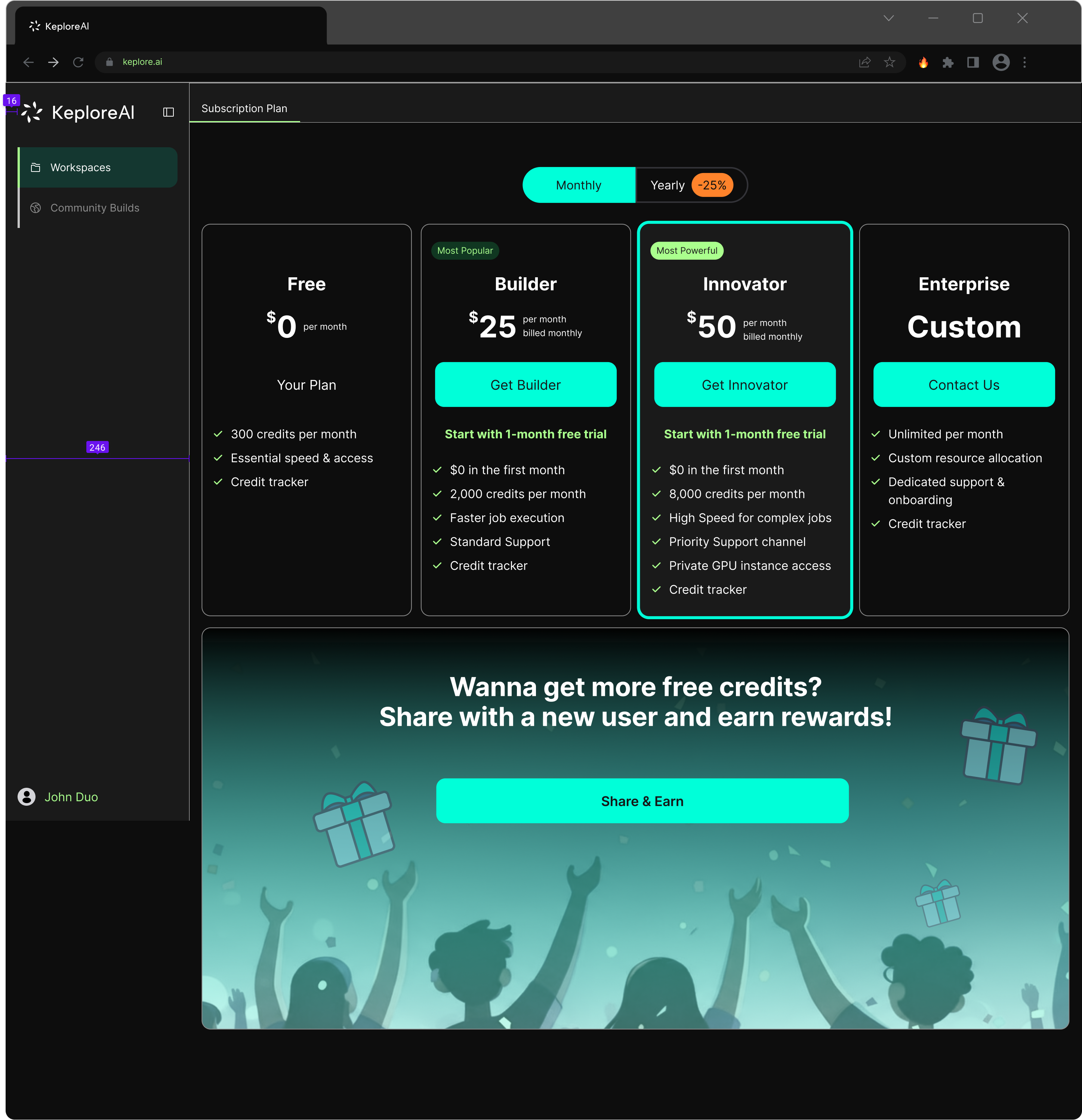
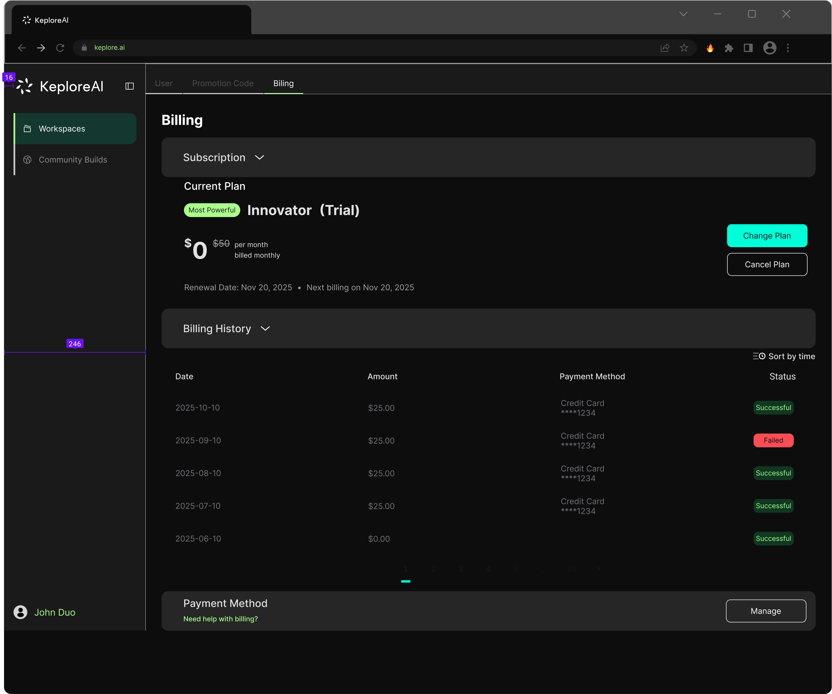
Subscription & billing system
The subscription system needed to support four tiers mapped to different scales of industrial use:
Free — 300 credits/month, basic access for evaluation Builder ($25/mo) — 2,000 credits, faster execution, standard support Innovator ($50/mo) — 8,000 credits, GPU access, priority support Enterprise (custom) — unlimited resources, dedicated onboarding
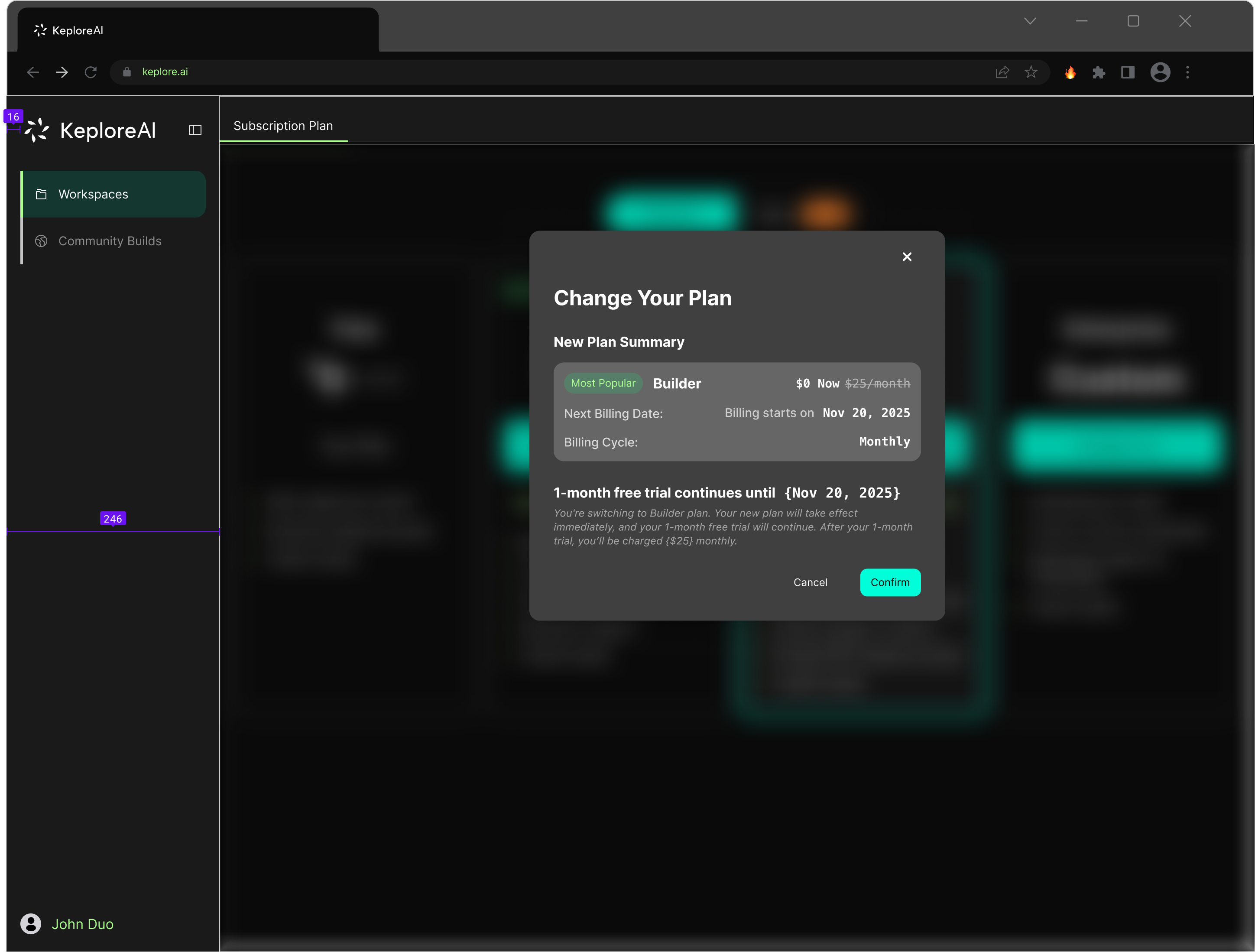
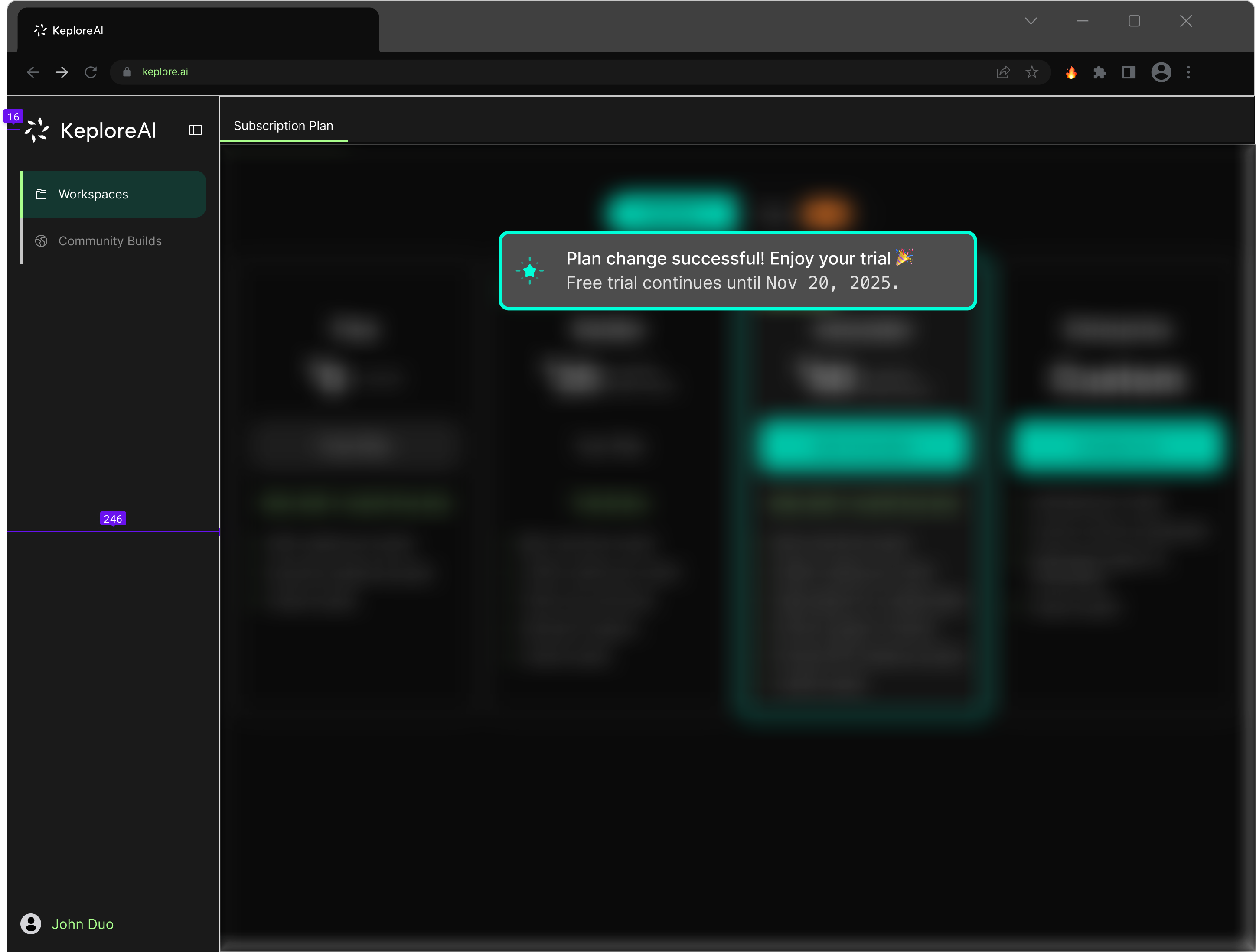
Change plan flow
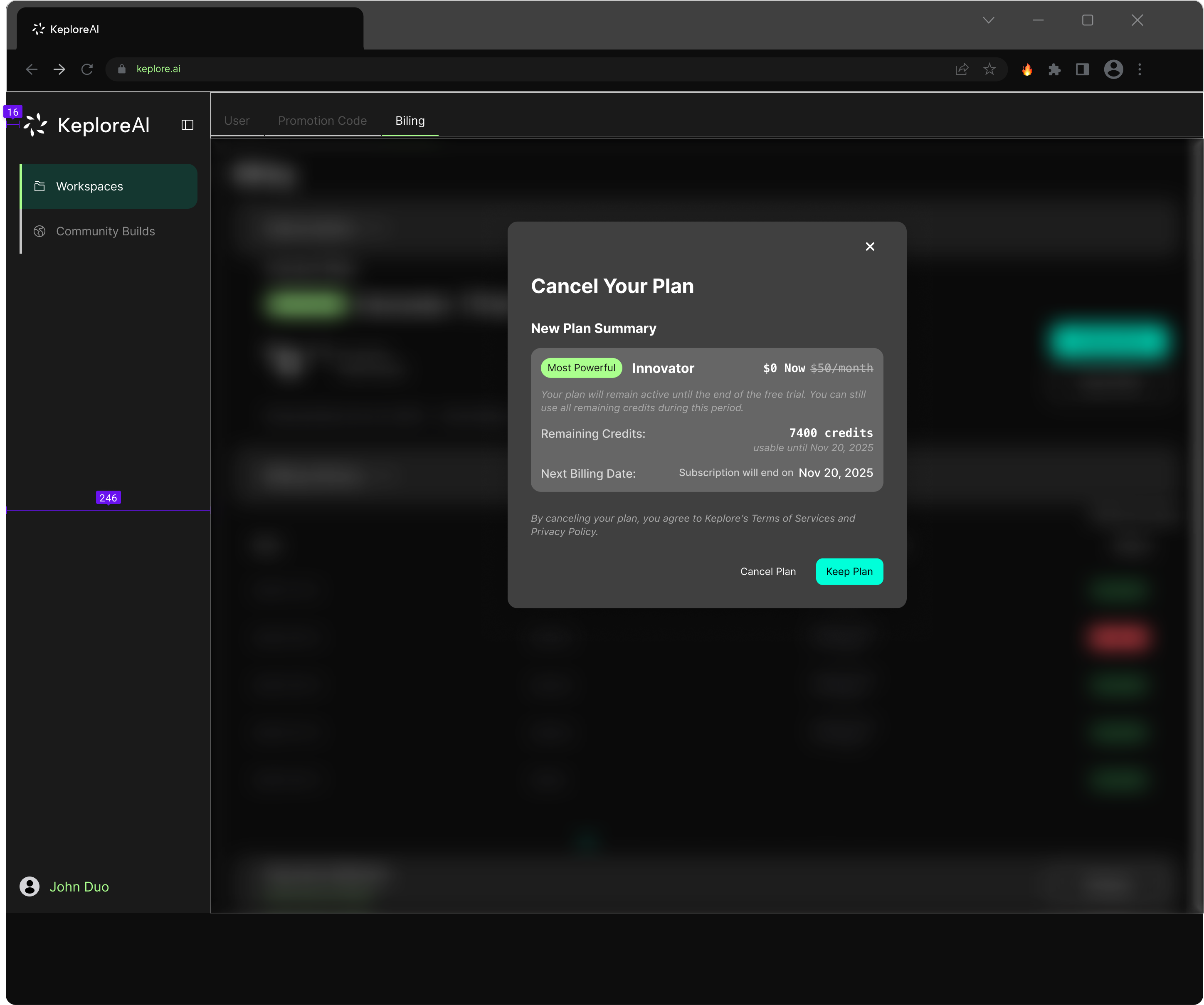
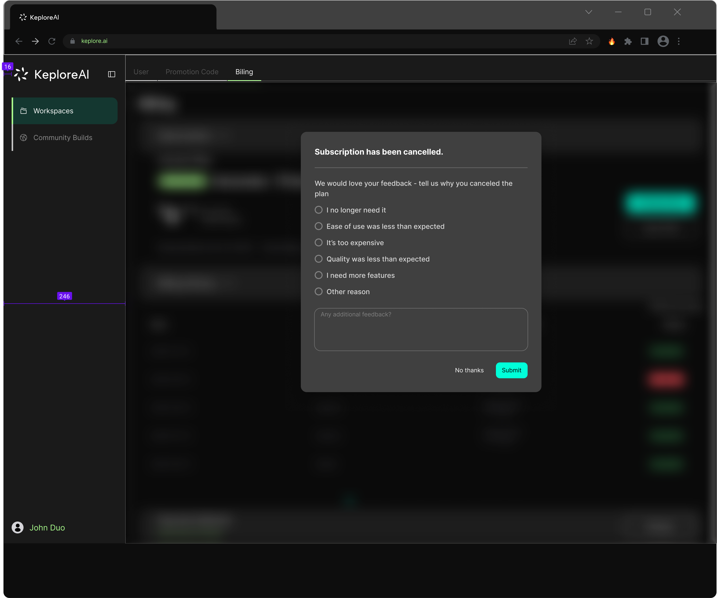
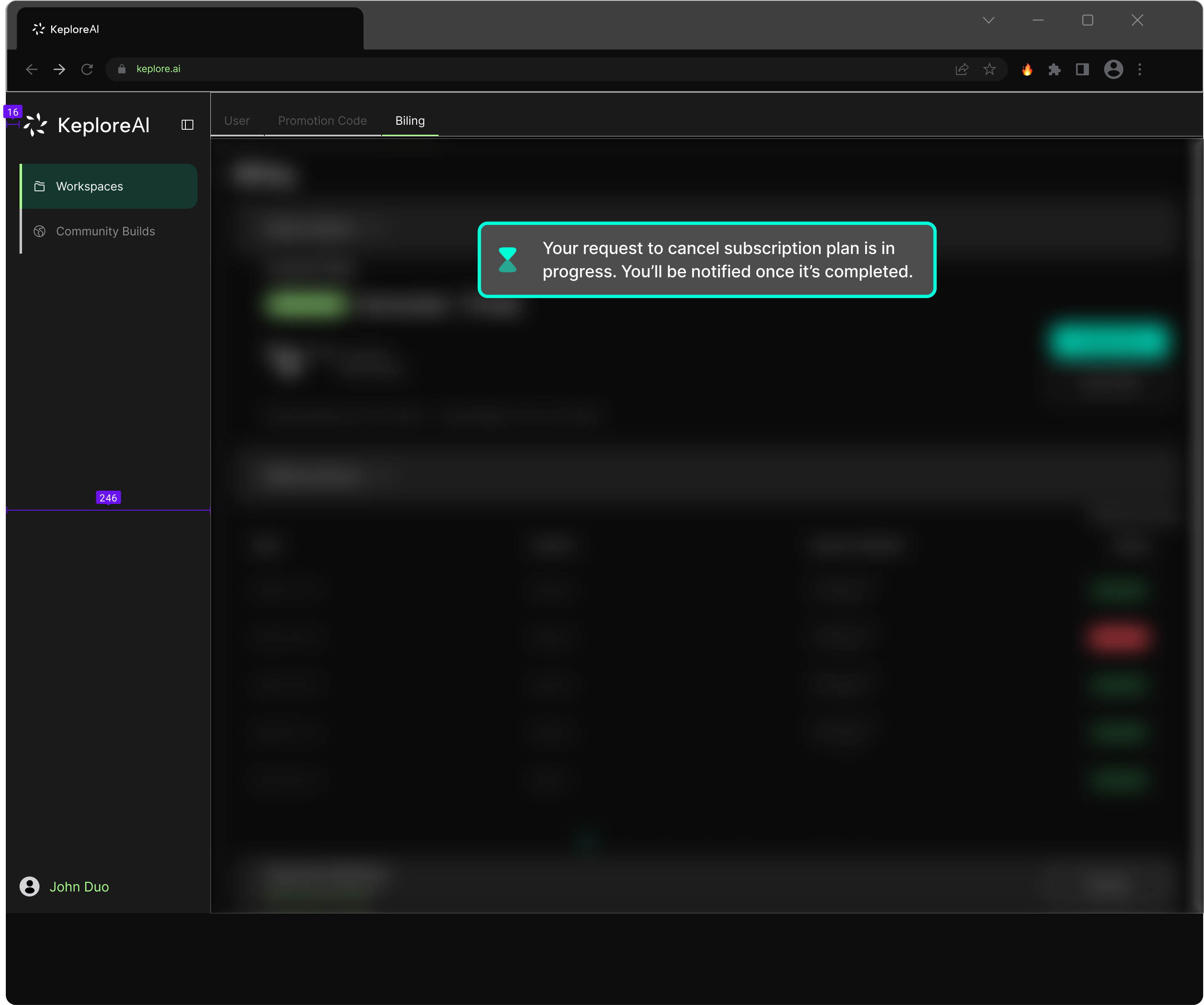
Cancel plan flow
The cancellation flow was designed as a retention and feedback opportunity. Instead of a single confirmation, the flow includes a summary of what the user will lose, followed by a feedback survey collecting structured reasons for cancellation — data that feeds back into product decisions.
2.0 currently serves 3 paying enterprise clients across distinct industrial verticals:
Chinese manufacturer
Magnetic defect detection, visual inspection deployed across 400–500 machines/year (~$200K/year revenue)
Geely (Lotus parent)
R&D AI tools, $500/month subscription
US robotics integrator
System integration projects, $5K–$20K per engagement
$200K ARR in pipeline.
The ToB pivot, validated by research, directly informed every design decision on this page.