02 / 03
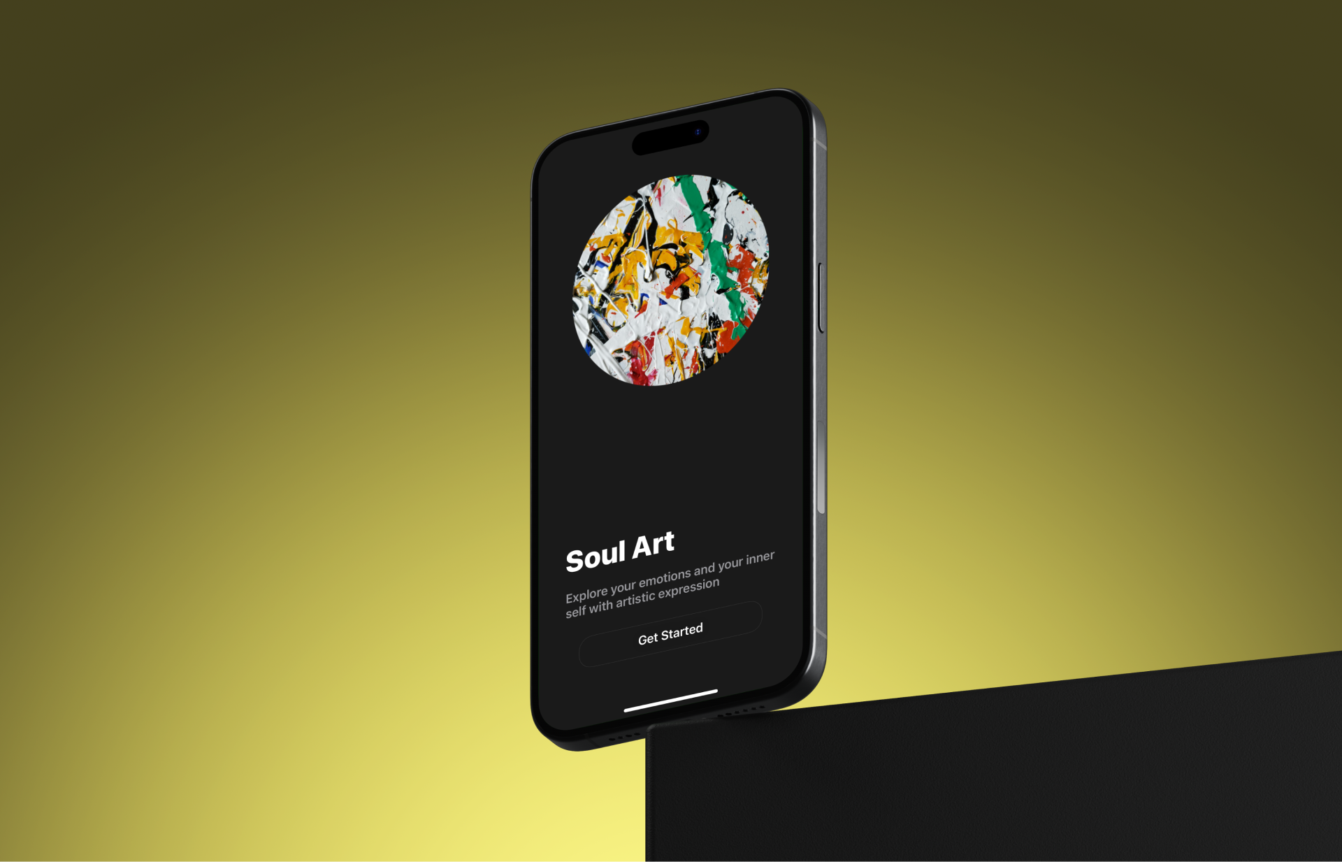
SoulArt
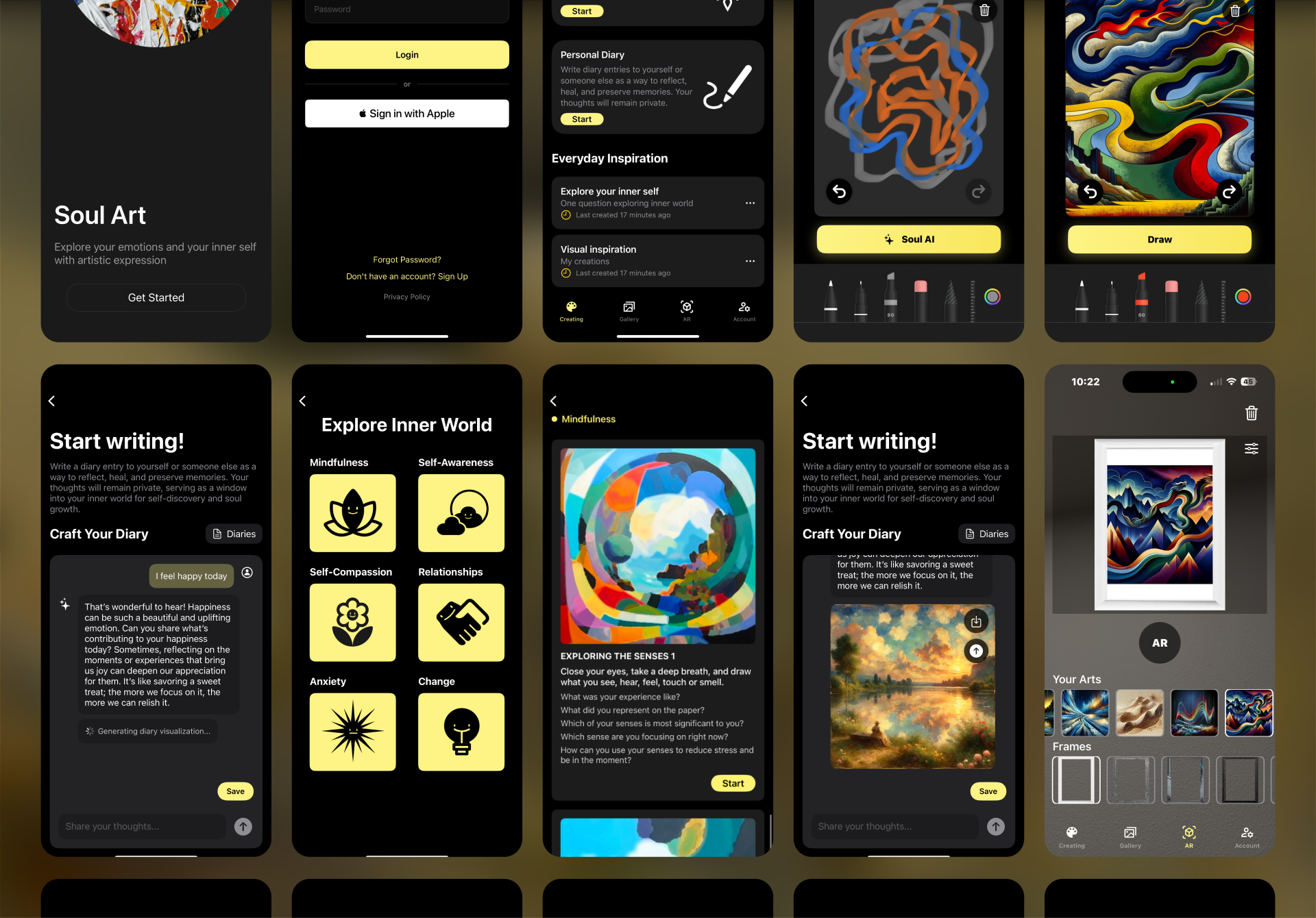
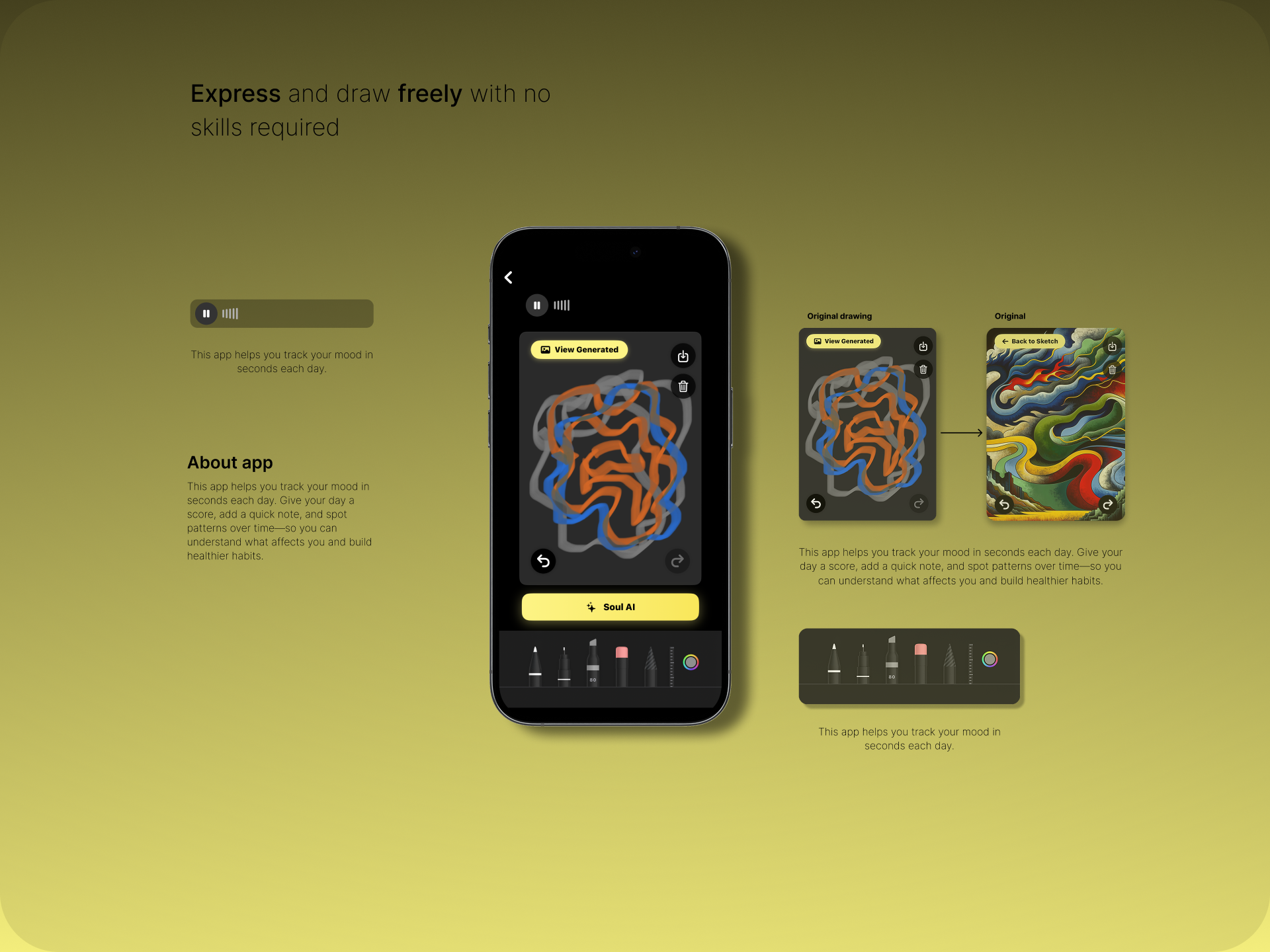
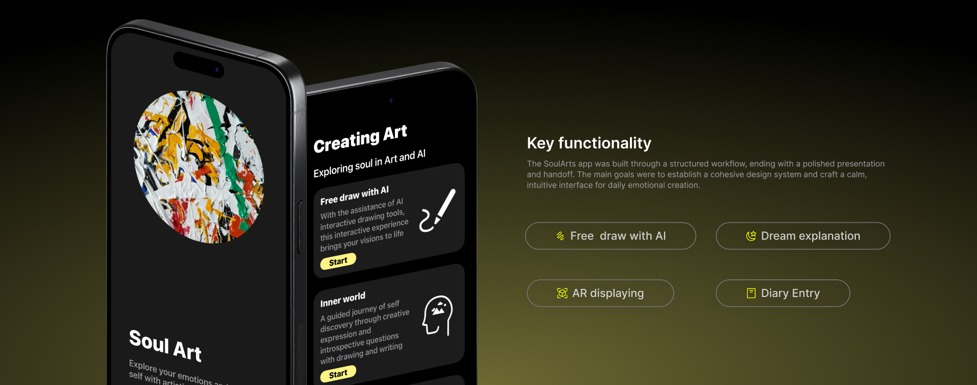
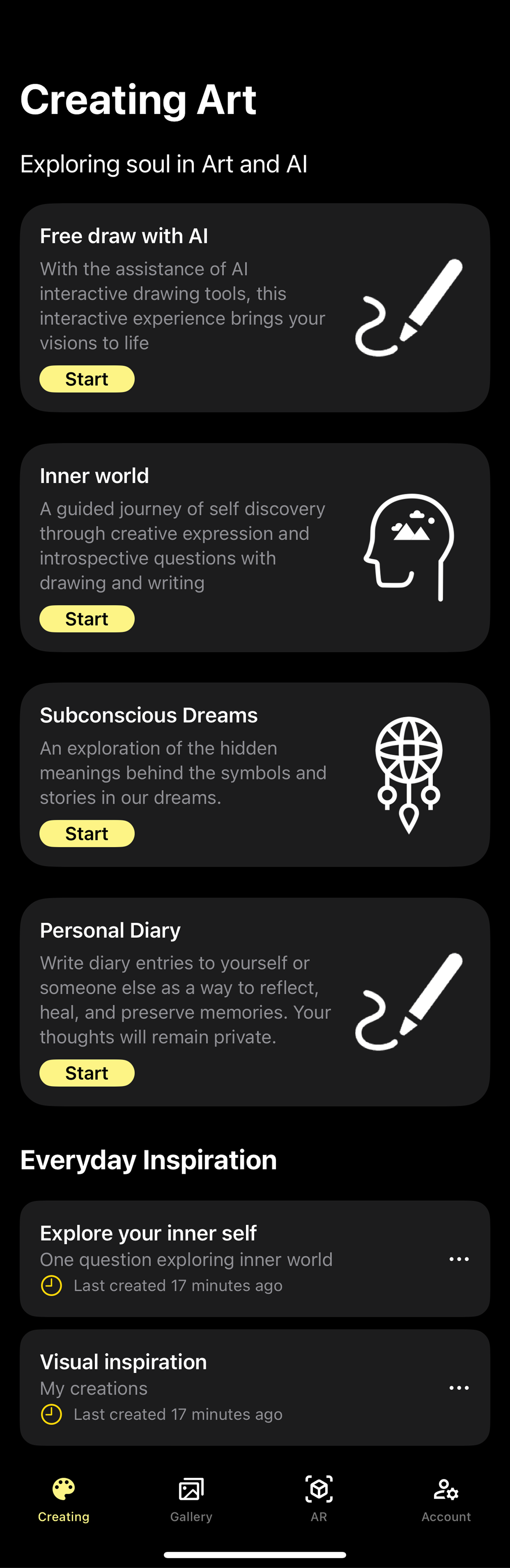
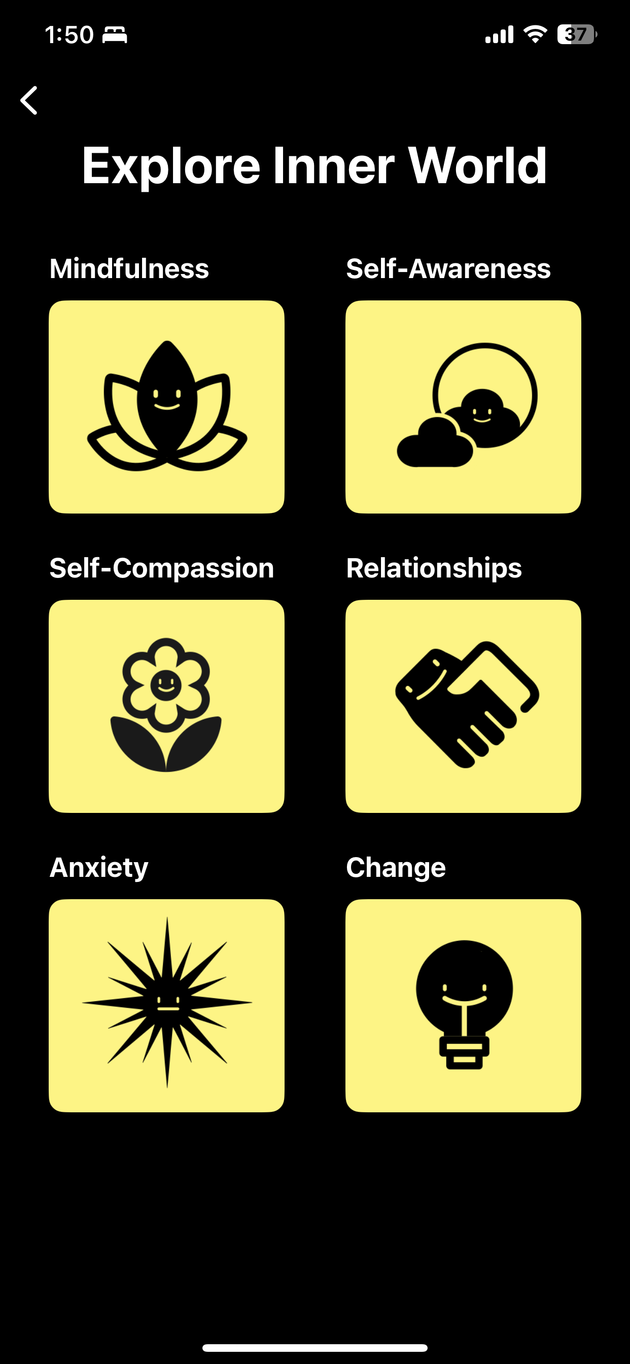
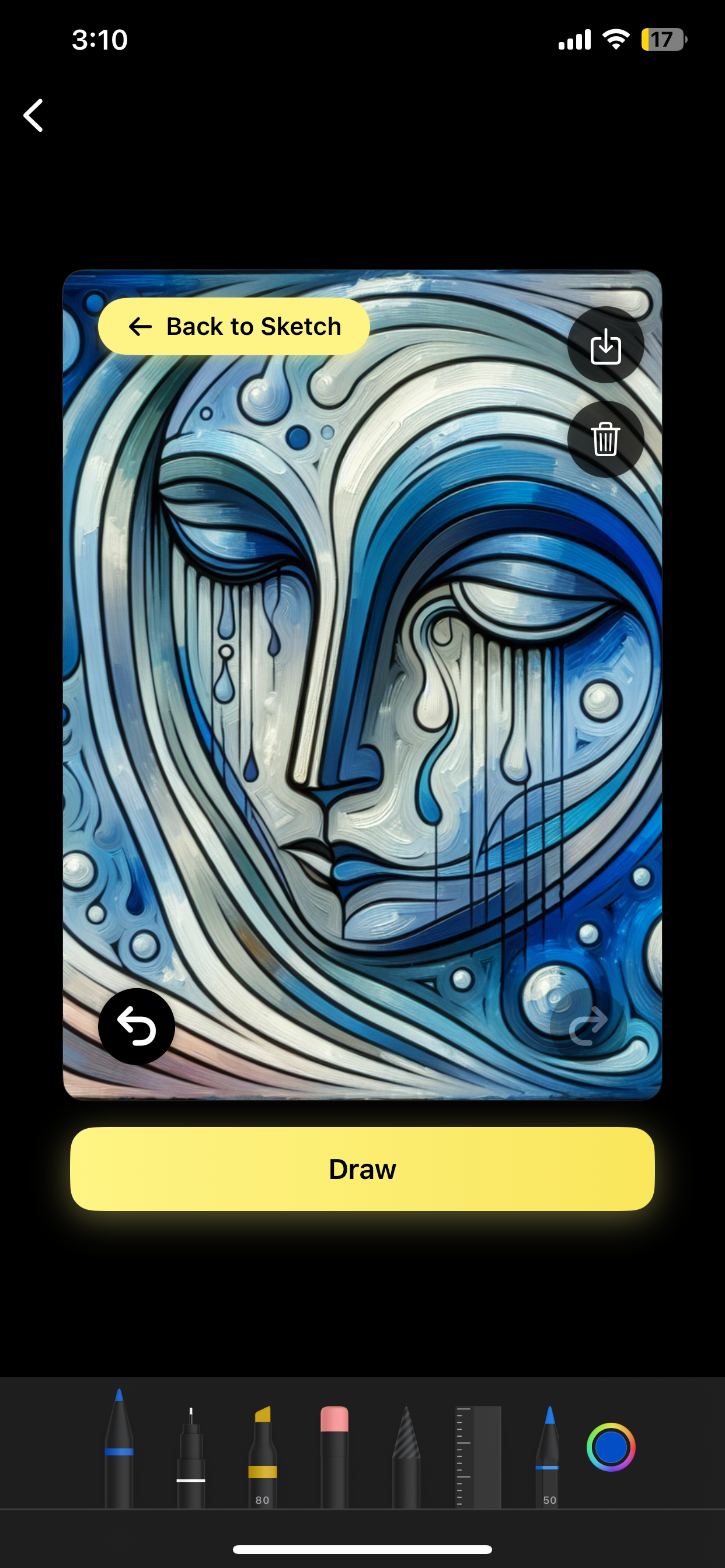
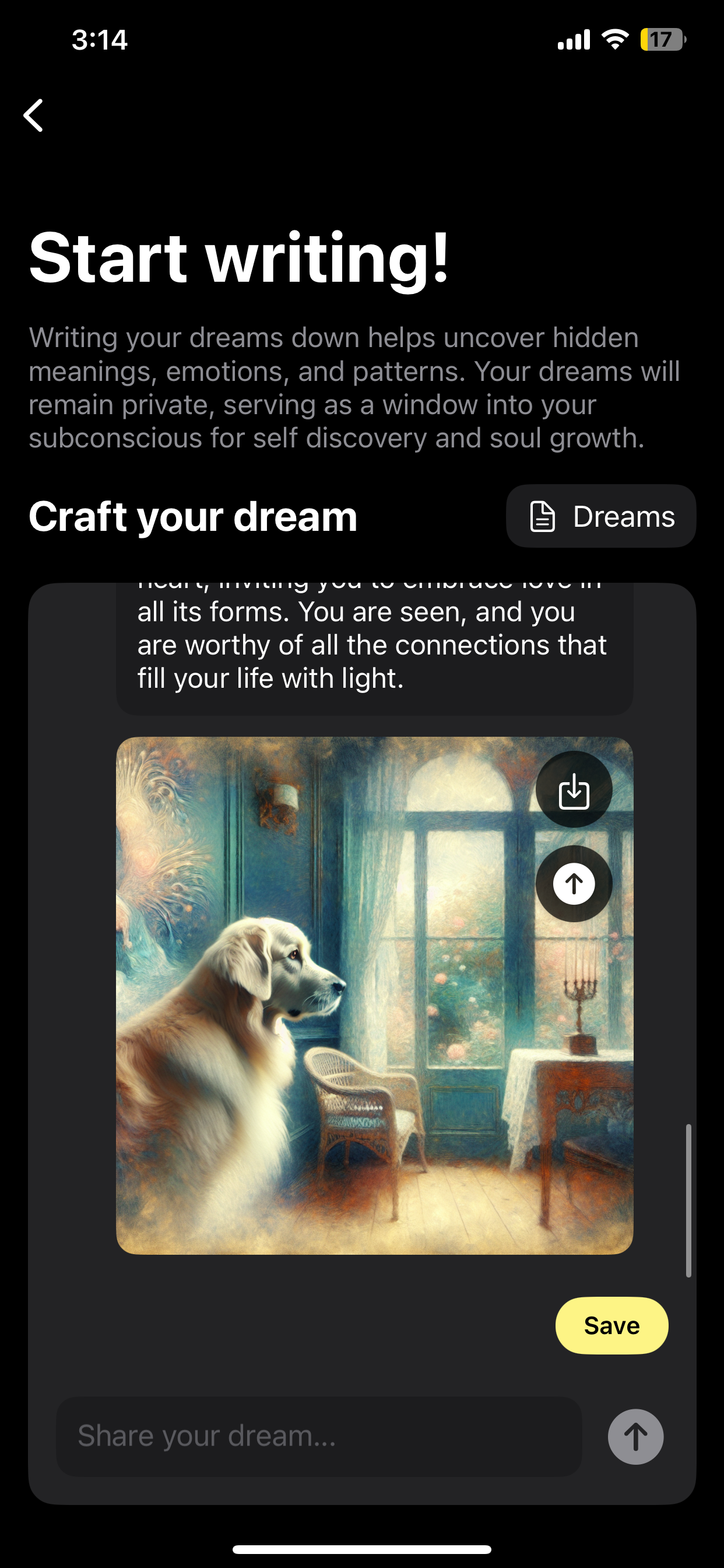
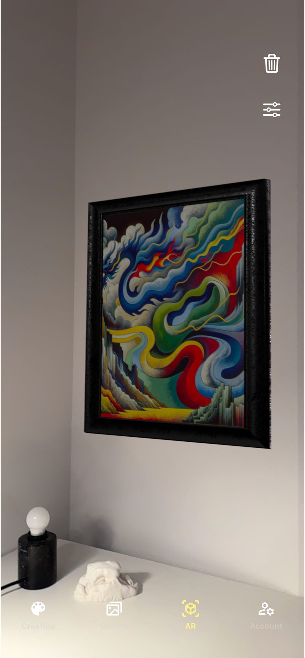
The hardest visual decision was the AI-generated image style. Early versions let the AI do whatever it wanted — the results were technically impressive but visually inconsistent. One session looked like watercolor, the next like sci-fi concept art. That inconsistency broke the sense of a personal creative space.
I locked the style: abstract, thick-stroke, emotionally expressive — consistent enough that users always recognize the output as "theirs," distinctive enough that it feels like art rather than a filter. The brand color, warm yellow on deep black, carries the same logic — warm enough to feel safe, bold enough to feel like creative energy rather than therapy.
Home
Icon System
AI Generation
Dream Visualization
AR Display
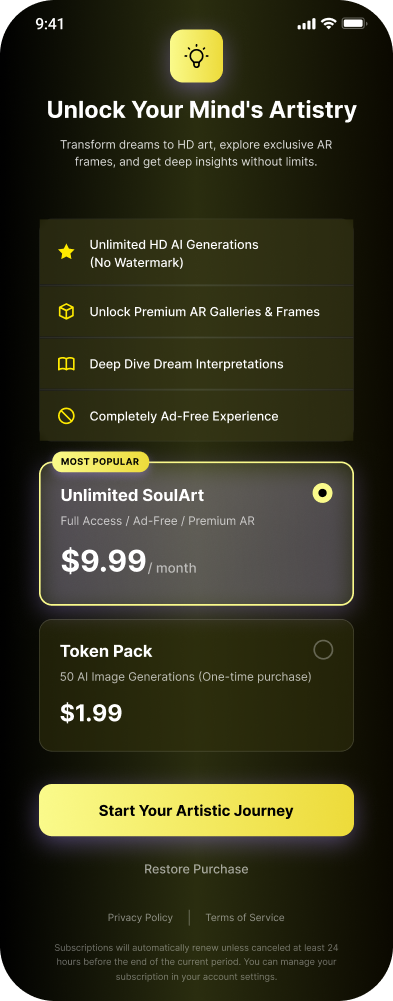
Pricing
Live on the App Store. Early users praised the visual coherence of AI-generated outputs.